.avif)
Freevisuals

Download this free After Effects preset and use it for your videos today, this skew in text animation preset can be fully customized at 1280p.
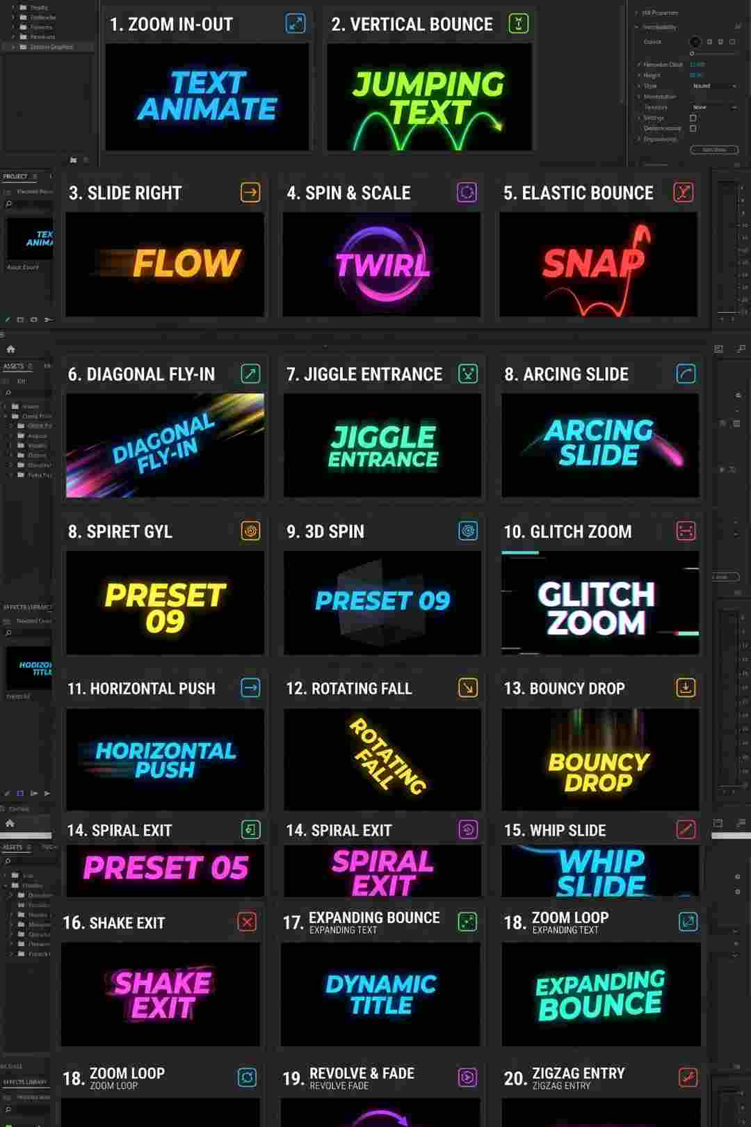
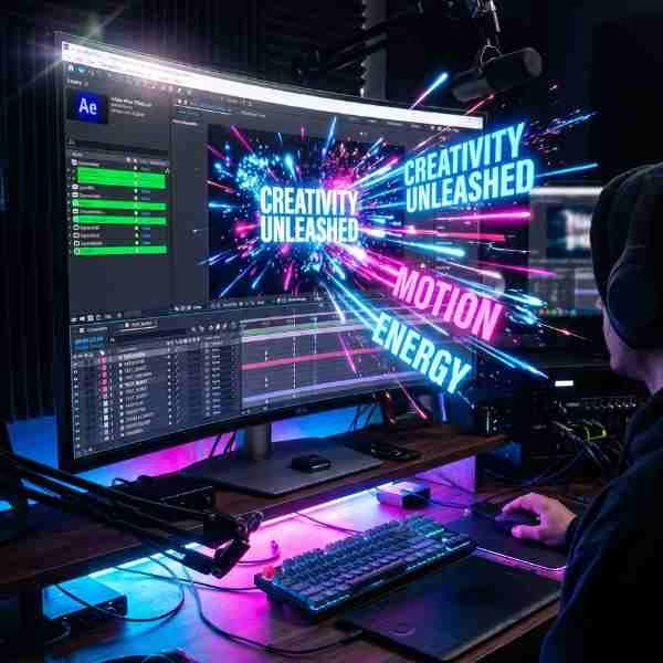
Download FREEGo Pro To DownloadDownload NOW!Text doesn't need to simply fade or pop onto screen to feel intentional, sometimes a bit of dynamic motion makes all the difference between a title that feels like an afterthought and one that feels genuinely designed and considered. Skew Text In is a kinetic text animation preset that brings text onto screen with a dynamic, angled skew motion, text entering at an angle before settling into its final, level position, adding a sense of energy and movement to titles, callouts, and supporting text throughout an edit.
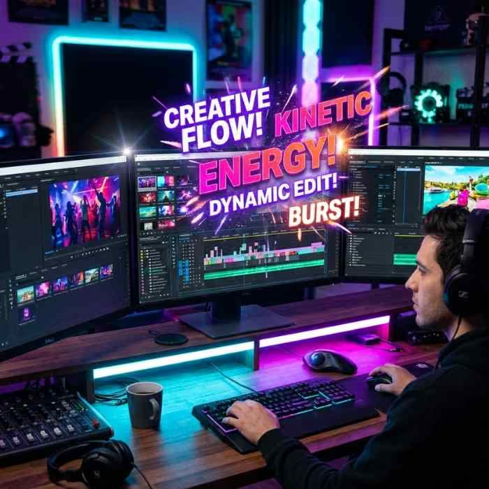
If you're building a broader kinetic typography sequence around this preset, check the specific product page to confirm the exact software this file is built for before combining it with other title work in your project. For music to pair with energetic, kinetic text sequences, Artlist and Epidemic Sound both carry upbeat, driving tracks well suited to this kind of dynamic text motion.
Static text, appearing instantly or via a simple fade, reads as neutral and unremarkable, which is sometimes exactly what a project needs, but often leaves genuine visual energy on the table for content that wants its titles and callouts to feel like an active part of the edit's overall rhythm rather than a passive layer sitting on top of it. A skewed entrance animation specifically introduces a sense of directional movement and mild visual tension, text arriving at an angle and resolving into its final position creates a small but genuine moment of visual interest that a flat fade or simple cut doesn't achieve on its own.
Skew Text In is built to add this kind of kinetic energy without requiring manual keyframe animation work every time a new title or callout is needed. Since the underlying skew motion is already built into the preset, your actual customization work is limited to updating the text content, timing, and color to fit your specific project, rather than needing to construct the underlying animation curve from scratch for every new piece of text.
The core use case this preset suits well, giving section titles and chapter headers a dynamic entrance that reinforces a video's overall energy and pacing.
Supporting text elements, names, statistics, key points, benefit from this preset's kinetic entrance to draw viewer attention at the moment they appear.
Content with an inherently energetic tone, sports highlights, action content, benefits from text motion that matches the overall pace and intensity of the footage being shown.
Promotional content wanting text callouts to feel dynamic and attention-grabbing rather than flat and static benefits from this preset's kinetic quality.
Music videos incorporating on-screen text or lyric callouts can use this preset to add visual rhythm that complements the track's own energy and pacing throughout.
Head to the download page and grab the preset file.
Check the specific download page to confirm which editing software this preset is built for before proceeding with installation.
If the download arrives as a zipped folder, extract it to a location you'll remember, ideally a dedicated project assets folder.
Follow the included installation instructions specific to your software, typically involving placing the file into a designated presets or titles folder.
Most software needs to be restarted, or the relevant browser refreshed, before a newly installed preset appears.
Locate the preset within your software's effects or titles browser and apply it to your text layer or title element.
Update the wording to match your specific title, callout, or supporting text.
Fine-tune how quickly the skew motion resolves to match your project's specific pacing needs.
Update the text color to align with your project's specific branding or color grade.
Confirm the animation timing and legibility within your full sequence, then render and export using your project's standard delivery settings.
Kinetic typography, text designed to move and animate as a core part of its visual presentation rather than sitting static on screen, has developed into a genuinely established design discipline with its own principles and conventions, drawing on both traditional graphic design and animation timing principles. The core insight behind effective kinetic typography is that text motion should reinforce meaning or energy rather than existing purely as decoration, motion that feels arbitrary or disconnected from a project's actual content and tone can distract from rather than enhance the text's communicative purpose.
Skew Text In fits within this broader discipline by offering a specific, well-defined motion style, a directional, angled entrance, that suits certain energetic, dynamic content contexts particularly well while remaining a poor fit for calmer, more restrained projects. Understanding kinetic typography as a genuine design choice with specific appropriate contexts, rather than a universally applicable effect suited to every project, helps ensure this preset gets applied where it genuinely serves the content rather than being used indiscriminately across projects with very different tonal needs.
Applying this preset to a calm, understated project. The skewed, kinetic motion suits energetic, dynamic content, applying it to a slow, contemplative project can feel visually mismatched.
Inconsistent timing across multiple text elements within the same edit. Varying skew speed and timing unpredictably between different titles or callouts undermines the sense of considered, intentional design.
Using overly long text content. Since the text is actively in motion during its entrance, lengthy phrases can be harder to read clearly than more concise wording.
Ignoring color contrast against your background footage. Always confirm text remains clearly legible against your specific footage before finalizing, regardless of how well the motion itself looks.
How To Get Perfect Speed Ramp Transitions In Premiere Pro, useful background on pairing dynamic text motion with complementary speed-based editing techniques for a cohesive, high energy overall sequence.
For projects using multiple text elements throughout, titles, lower thirds, callouts, applying this preset consistently across all of them helps establish a cohesive kinetic typography style that feels considered rather than like several unrelated animation choices applied inconsistently. Establishing your specific timing, color, and skew angle preferences early in a project, then applying these consistently across every subsequent text element, produces a considerably more polished, professional final result than varying these choices unpredictably from one text element to the next.
This consistency principle matters particularly for longer projects or ongoing content series, where a recognizable kinetic text style, applied consistently across multiple videos, can become part of a broader recognizable visual identity, similar to how a consistent color grade or intro sequence builds recognition over an extended body of work.
While this preset's default skew angle and timing provide a solid, ready-to-use starting point, most kinetic text presets of this kind support at least some adjustment to intensity, a more subtle, restrained skew angle for projects wanting understated energy, or a more dramatic, pronounced angle for content wanting to lean fully into a bold, high-energy visual style. Testing a few different intensity levels against your specific footage and project tone, rather than assuming the default settings automatically suit every possible use case, helps ensure the final result genuinely matches your intended energy level rather than feeling either too subtle to register or too aggressive for your specific content.
This kind of calibration work is worth doing early in a project rather than after applying the preset across many individual text elements, since establishing the right intensity level upfront saves considerable time compared to going back and adjusting numerous already-applied text animations individually later in the editing process.
While kinetic text motion adds genuine visual energy, it's worth being mindful of accessibility considerations specifically for viewers who rely on reading on-screen text carefully, including viewers with certain visual processing differences or those watching without audio and depending on text for comprehension. Text that moves too quickly or settles into its final position too briefly before cutting away can genuinely reduce comprehension for some portion of your audience, even if the motion itself looks visually appealing to viewers without these specific considerations.
A reasonable practical guideline is ensuring text remains in its final, settled, readable position for long enough that an average viewer could comfortably read it at a natural pace, generally at least a couple of seconds for a short phrase, longer for more substantial text content, rather than prioritizing visual motion at the expense of genuine readability and comprehension for the full range of viewers your content might realistically reach across different platforms and viewing contexts.
Check the specific download page to confirm software compatibility before installation.
Yes, both are editable directly within your editing software once the preset is applied.
Yes, timing is adjustable to match your project's specific pacing needs.
Not particularly, its kinetic, energetic motion style suits dynamic, high energy content better than calm or contemplative projects.
Check the specific license terms on the download page to confirm coverage for your intended commercial use case before using it in paid client or agency work.
Generally yes, for visual consistency, though you can test different intensity levels early in a project to establish the right setting before applying it broadly across all your text elements and titles.
Affiliate Disclosure: This post may contain affiliate links. If you make a purchase through one of these links, FreeVisuals may earn a commission at no extra cost to you. We only recommend products and platforms we genuinely believe in. Read our full disclosure policy.
Download free video templates, LUTs, and presets for Premiere Pro, After Effects, DaVinci Resolve, CapCut, and Final Cut Pro.