.avif)
Freevisuals
Master the art of color grading in Adobe Premiere Pro 2025 with this in-depth tutorial from experienced editor Jack at Freevisuals.net. Learn to use the Lumetri Color panel, scopes, curves, LUTs, and advanced techniques to create stunning cinematic looks — step-by-step guide with screenshots and video references.
Hey everyone, it's Jack here from Freevisuals! As an experienced video creator and editor who's been working with Adobe Premiere Pro for over a decade, I've color graded hundreds of projects — from short social media clips to full-length commercials and music videos. Color grading is one of the most powerful ways to elevate your footage from amateur to professional, setting the mood, directing viewer attention, and creating that signature cinematic feel.
In this comprehensive Premiere Pro color grading tutorial , I'll walk you through everything you need to know about mastering the Lumetri Color panel. Whether you're a beginner just starting out or an intermediate editor looking to refine your skills, this step-by-step guide will help you achieve stunning results. We'll cover basic corrections, creative adjustments, using scopes for precision, applying LUTs, advanced techniques like masking, and much more.
By the end of this tutorial, you'll be confident in color grading any type of footage in Adobe Premiere Pro. Let's dive in!
Color grading isn't just about making your video "look pretty." It's a crucial post-production step that:
In Premiere Pro 2025, the built-in Lumetri Color tools are incredibly powerful — you often don't even need to round-trip to DaVinci Resolve for most projects. Adobe has continued to improve the panel with better performance, AI-assisted tools, and enhanced scopes.
Pro Tip from Jack: Always color grade after your edit is locked. Changing cut points later can mess up your carefully applied grades!
Before we touch any sliders, let's optimize your workspace.
Now you're ready. There are two main ways to apply Lumetri Color:
I always use adjustment layers for most of my grading — it's non-destructive and efficient.
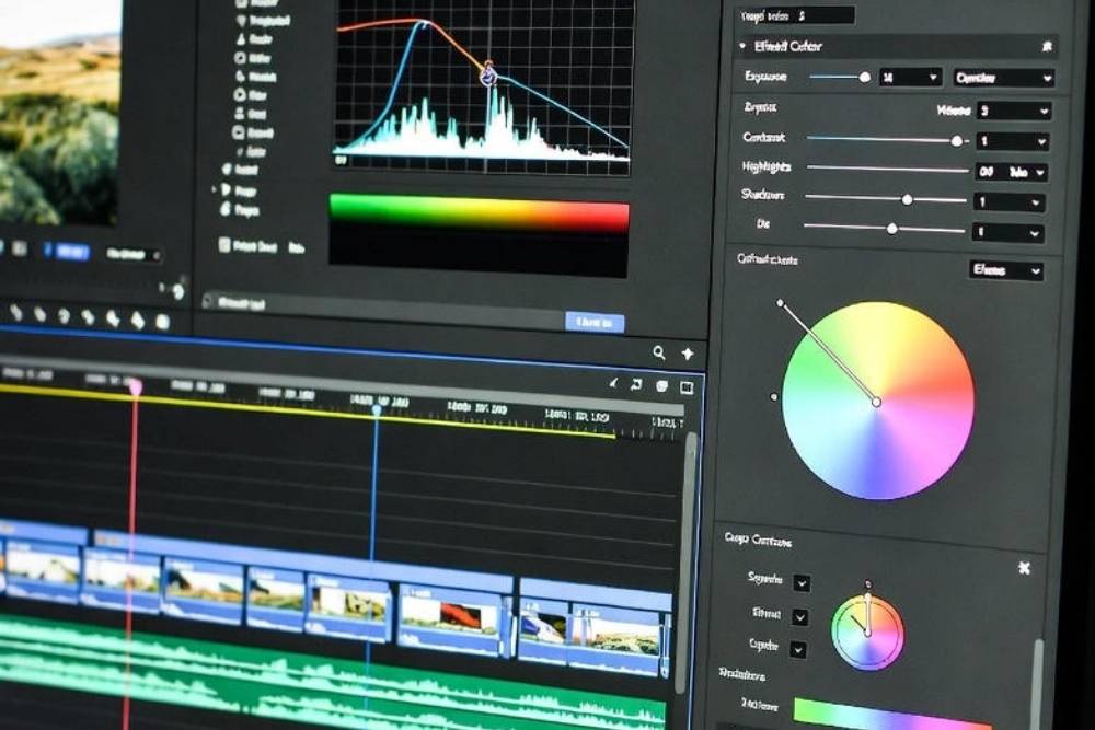
Scopes are essential for accurate color grading. They show data, not just what your uncalibrated monitor displays.
Open scopes via Window > Lumetri Scopes or in the Color workspace.
Key scopes in Premiere Pro:
Jack's Advice: Always reference scopes alongside your eyes. Start with technical correction using scopes, then move to creative looks.
Basic correction fixes technical issues before creative grading.
In the Lumetri Color panel, start with the Basic Correction section.
If your footage is LOG (flat profile like S-Log, C-Log), apply a technical LUT here to normalize it. Adobe includes many built-in ones under the dropdown.
Use the eyedropper to click on something that should be neutral gray/white in your shot. Or manually adjust Temperature (blue/orange) and Tint (green/magenta).
Workflow Tip: Set Blacks > Whites > Contrast > Exposure > Shadows/Highlights > Saturation.
Now the fun part — creative adjustments!
Three wheels: Shadows, Midtones, Highlights.
My favorite tool for precision.
Pro Technique: Create an S-curve on the RGB curve for instant filmic contrast.
Isolate specific colors for adjustment.
This is perfect for making skies pop or correcting orange skin tones.
LUTs (Look-Up Tables) are presets that transform colors instantly.
In Lumetri > Creative > Look dropdown, browse Adobe's built-ins or import your own (.cube files).
Freevisuals Recommendation: Download free cinematic LUT packs from sites like Envato or Artlist
Apply subtly — lower the intensity slider to 50-70% for natural results.
Add subtle darkening to edges to focus attention (Creative section).
In the effect controls for Lumetri (not just the panel):
Copy Lumetri from one clip (Alt-drag or right-click > Copy > Paste Attributes), then tweak.
For multi-cam or interviews, use adjustment layers per scene.
If working in Rec.2020/HDR, switch sequence settings and use HDR scopes/wheels (new in recent versions).
Let's look at common scenarios:
For visual demonstrations, check these excellent YouTube tutorials:
At Freevisuals, we also have a growing YouTube channel with hands-on Premiere Pro tips — subscribe for more!
When exporting:
In Media Encoder, enable "Match Source" for most cases.
Color grading is an art that improves with practice. Start simple — correct, then create. Experiment on free stock footage (we have tons at Freevisuals.net!).
This Premiere Pro color grading tutorial covers the essentials and beyond for 2025. Bookmark it, try the steps on your next project, and share your results in the comments below.
If you found this helpful, check out our other Premiere Pro tutorials here on Freevisuals. What's your biggest color grading challenge? Let me know!


.avif)


.avif)
.avif)
.avif)
.avif)


