.avif)
Freevisuals
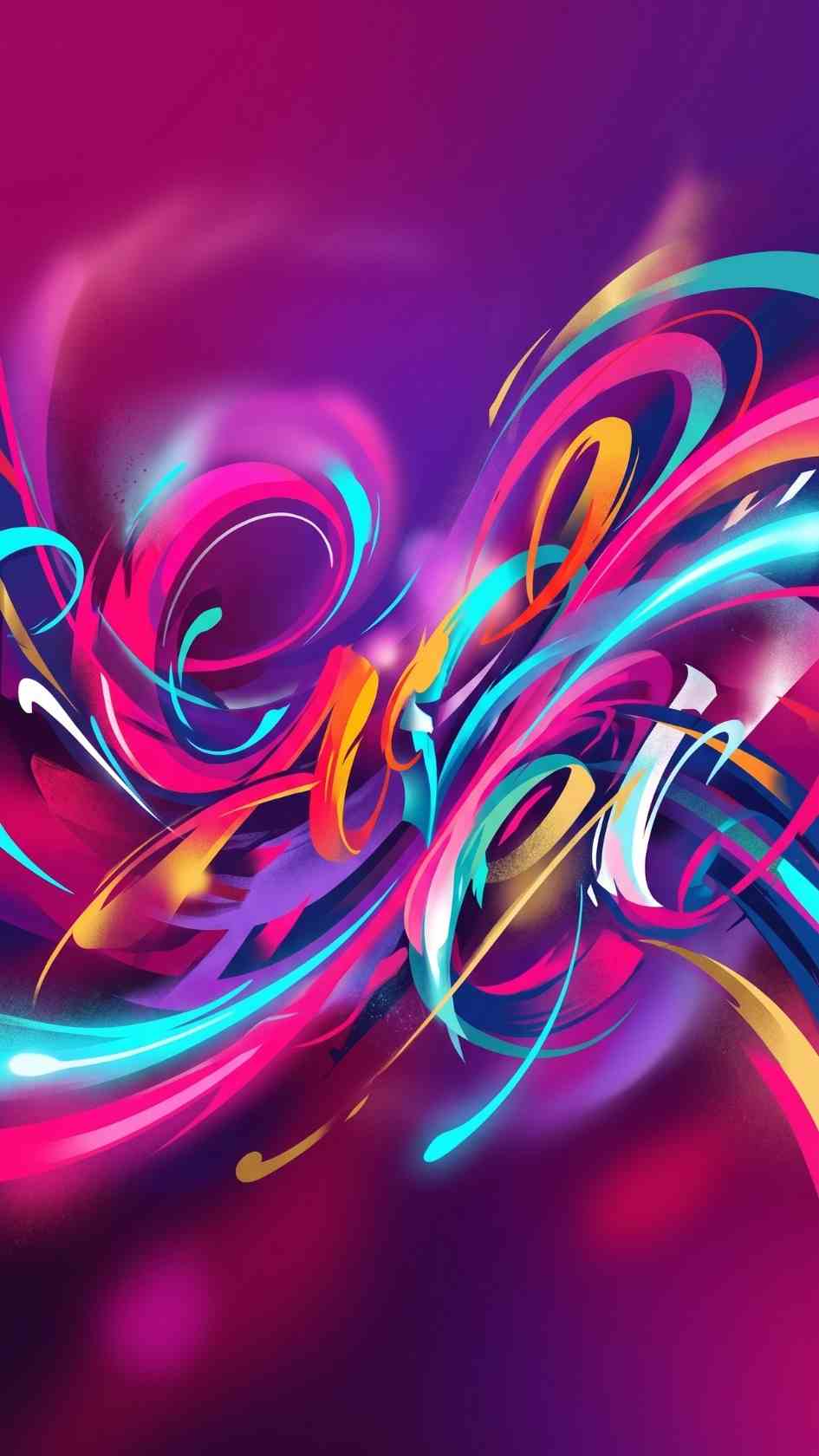
In Control Kinetic Typography by Sliced Bread, 12 modular After Effects kinetic typography animations with color control and transparent background...
Download FREEGo Pro To DownloadDownload NOW!Download On Artlist
Kinetic typography lives or dies on modularity, the ability to mix, reorder, and stitch individual title moments together into a genuinely custom sequence rather than being locked into a single fixed animation from start to finish. In Control Kinetic Typography, made by Sliced Bread and available through Artlist, is built specifically around this idea, twelve individually modular kinetic typography animations with a minimal but bold, striking design language, each one built as a separate composition you can freely combine into whatever order your specific project actually needs.
If you're building a broader kinetic type sequence around this template, our Range Selector tutorial is genuinely useful for understanding the character and word level animation principles a modular kinetic type system like this one typically relies on internally. For music with the kind of confident, rhythmic energy that pairs naturally with bold kinetic titles, Artlist's own music catalogue carries a genuinely strong selection well suited to this exact style.
A fixed, single sequence kinetic typography template forces you to either use the entire pre built sequence as designed or manually rebuild sections yourself if your specific content doesn't match the original pacing. A genuinely modular template like this one solves that problem directly, since each of the twelve animations exists as its own independent composition specifically built with the momentum needed to connect smoothly into whatever order you actually need for your specific project, three titles for a quick promo, all twelve stitched together for a longer, more elaborate sequence, or any custom combination in between.
This modularity is precisely what separates a genuinely flexible, reusable asset from one that only fits the exact scenario its original designer had in mind, and it's part of why a template like this one can remain useful across a genuinely wide range of different future projects rather than being tied to one specific use case.
Head to the Artlist download page and grab the project files.
Open the .aep file in After Effects CC 2020 or a newer compatible version and allow it to fully load.
Browse through the project panel to preview each of the twelve individual kinetic typography compositions, noting which specific ones fit your project's tone and pacing.
Decide on your specific order, since each composition is built with connecting momentum, arranging your chosen titles back to back in your timeline should already feel cohesive without extensive manual timing adjustment.
Double click into each text layer within your chosen compositions and replace the existing copy with your own.
Decide between a solid color background, your own media with the automatic high contrast effect applied, or a fully transparent alpha channel background depending on how you plan to composite this title sequence into your larger project.
Use the template's color controls to quickly update the palette across your chosen titles.
Use RAM Preview to confirm your full stitched sequence reads clearly and at an appropriate pace, then render using your project's standard export settings.
For a genuinely useful walkthrough of building this exact style of modular, connected kinetic typography sequence, watch Super Quick Kinetic Typography In After Effects. This is worth watching specifically because it covers the underlying clean, contemporary kinetic type approach this template's twelve animations are built around, giving you genuine confidence customizing the existing sequence, or building your own additional connecting animations that match the template's established visual language once you've worked through what's already included.
The modular, stitchable structure genuinely suits longer form content specifically, where multiple sequential title beats need to feel connected rather than isolated.
Clean, bold kinetic typography suits business content wanting genuine energy without an overly decorative or genre specific visual treatment.
Content built around several sequential statements or statistics benefits considerably from having twelve distinct, individually swappable title options to draw from.
Highlight compilations pulling multiple distinct quotes or moments together benefit from this template's built in modularity, letting each highlight receive its own distinct title treatment.
Content walking through several sequential product features can use different individual animations from this set to visually distinguish each new point being introduced.
The solid color background mode offers the simplest, universally compatible option, a clean backdrop that lets your title's own animation and color carry the full visual interest without any additional complexity. The media background mode, using your own footage with the automatic high contrast effect applied, integrates your titles directly with real content, genuinely useful for opener sequences wanting to establish visual context immediately alongside the title itself. The transparent alpha channel mode offers the most compositing flexibility of the three, letting you layer your finished title sequence over any background treatment built entirely separately, useful for editors wanting complete independent control over their background choice.
The automatic high contrast effect specifically applied when using your own footage as a background deserves a bit more attention, since understanding how it actually works helps you get genuinely predictable results across different source footage. This effect analyzes your background media and adjusts its overall contrast and brightness specifically to keep your overlaid text legible, rather than requiring you to manually color grade every piece of background footage individually before it will work correctly with the template's included titles.
While this automatic adjustment works well across a genuinely wide range of typical footage, it is still worth previewing the actual result against your specific source material before committing to a final render, since footage with unusual color characteristics, extremely low contrast, dominant colors close to your text color, or unusual lighting conditions, may benefit from a small amount of additional manual adjustment on top of what the automatic effect already provides for a genuinely polished final result.
It's worth explicitly weighing this template's modular approach against the more common single, fixed sequence title template style found across most marketplaces, since each approach genuinely suits different specific needs. A fixed sequence template typically requires less upfront decision making, simply drop in your text and render, but offers considerably less flexibility once your specific content doesn't match the original designer's exact assumptions about pacing, number of titles needed, or overall sequence structure.
This template's modular approach requires slightly more upfront thought, deciding which specific animations to use and in what order, but rewards that additional consideration with genuine flexibility across a considerably wider range of actual project needs. For editors working across genuinely varied content, some projects needing just two or three quick titles, others needing a full extended sequence, this modular structure ultimately provides more practical long term value than a single, rigidly fixed alternative would.
Using text that's too long for a kinetic typography animation's built in timing. Since each composition has a specific pacing already established, significantly longer replacement text may need manual timing adjustment to avoid feeling rushed.
Choosing the media background mode without testing against your actual footage first. The automatic high contrast effect works well for many source clips but is worth previewing directly against your specific footage before committing.
Ignoring the connecting momentum between sequential compositions. Since these titles are specifically built to stitch together, placing them in an order that doesn't respect their built in directional momentum can undermine the smooth, connected feel the modular design is meant to achieve.
Overloading a short piece of content with too many of the twelve available animations. Even with genuine variety built in, using too many distinct styles within a short video can feel busy rather than intentional.
Since this template's modular structure lets you build genuinely custom sequences from its twelve component animations, it's worth saving your own favorite combinations as a personal starting template once you find a specific arrangement that works well for your regular content type. Rather than rebuilding your preferred sequence order from scratch on every new project, keeping a saved version of your established combination, with placeholder text ready for quick replacement, considerably speeds up your regular production workflow over time.
As with any Artlist asset, reviewing the current license terms before using this template within paid client or commercial work is worth doing upfront, particularly for corporate and brand video work where licensing clarity matters considerably. Confirming your specific intended use case is genuinely covered protects both your own business and gives your client real confidence in the assets underlying their finished deliverable.
This is a worthwhile step to build into your regular workflow specifically for editors and studios working across many different client projects, where licensing clarity becomes increasingly important the more frequently a specific template gets reused across paid, commercial engagements.
Beyond simple visual variety, a genuinely well built modular kinetic typography sequence benefits from deliberate attention to rhythm and pacing across the full stitched sequence, not just within each individual animation. Alternating between animations with different specific energy levels, a punchier, faster paced title followed by a slightly calmer one, for instance, creates a genuine sense of dynamic pacing across a longer sequence rather than a monotonous, evenly paced string of titles that can start to feel repetitive despite each individual animation being visually distinct from the last.
This kind of deliberate pacing consideration separates a genuinely considered, well built title sequence from one that simply strings together several visually different animations without genuine attention to how they actually feel when experienced consecutively by an actual viewer. Taking the time to review your full stitched sequence as a complete, continuous experience, rather than judging each individual animation only in isolation, tends to reveal pacing issues that would otherwise go unnoticed until a genuine audience actually watches the finished result.
In Control Kinetic Typography stands out specifically for its genuine modularity, twelve distinct, individually swappable animations built with the connecting momentum needed to stitch together into a custom sequence rather than a single fixed, take it or leave it title treatment. Combined with its flexible background options, including a genuinely useful transparent alpha channel mode, this template offers considerably more practical range than its compact 5.98MB file size might initially suggest. Taking the time to explore the full range of possible combinations gets you the most genuine value from this template's underlying modular design.
Yes, each of the twelve is built as its own independent, modular composition, letting you select and combine only the specific ones that fit your particular project.
Yes, alongside solid color and your own media backgrounds, a fully transparent alpha channel option is available for maximum compositing flexibility.
No, it works entirely with native After Effects tools.
The template is built for After Effects CC 2020 and remains compatible with newer versions.
Yes, the media background mode lets you drop in your own footage, with an automatic high contrast color effect applied to help keep your text legible.
Affiliate Disclosure: This post may contain affiliate links. If you make a purchase through one of these links, FreeVisuals may earn a commission at no extra cost to you. We only recommend products and platforms we genuinely believe in. Read our full disclosure policy.
Download free video templates, LUTs, and presets for Premiere Pro, After Effects, DaVinci Resolve, CapCut, and Final Cut Pro.