Fitness Transformation YouTube Thumbnail AI Image Prompt
The fitness and transformation niche on YouTube runs almost entirely on a single visual idea, the dramatic before and after split that tells a complete story in under a second of scroll time. A viewer does not need to read a title to understand what a transformation thumbnail is offering, the visual language of dim, defeated lighting on one side and confident, glowing lighting on the other does all the communication work instantly. This prompt is built specifically around that visual language, giving you a tested starting point for generating a thumbnail that reads clearly as a fitness transformation at a glance, even when shrunk down to the small size most viewers actually see it at on a mobile feed.
This page covers the prompt itself, how to adapt it for different fitness content angles, which AI image tools handle it best, and the practical workflow for turning the generated image into a finished, published thumbnail.
Why the Split Composition Works So Well
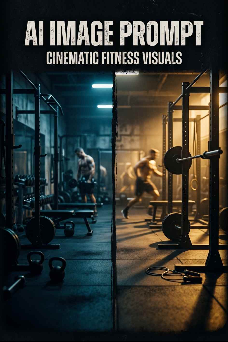
YouTube thumbnails succeed or fail in well under a second of viewer attention, which means the visual idea has to communicate before any conscious reading happens. A split composition thumbnail does this by using lighting and posture rather than text to tell the story. Cool, dim, slightly defeated lighting on one half signals the starting point. Warm, bright, confident lighting on the other half signals the result. A viewer's brain processes this contrast almost instantly, well before they consciously register what the video is actually about.
This is also why transformation thumbnails consistently outperform single image fitness thumbnails in click through testing across the niche. A single image of someone exercising communicates effort, but it does not promise a result. The split composition promises a specific, visible outcome, which is the actual thing most fitness audiences are searching for when they click on a transformation video in the first place.
The Role of Colour Temperature
The prompt specifically calls for cool blue toned lighting on one side and warm golden hour lighting on the other, rather than simply describing two different poses. Colour temperature is doing a lot of the emotional work here, cool tones are subconsciously associated with low energy and difficulty, while warm tones are associated with achievement and vitality. Generating the image with this colour contrast built in from the start produces a far stronger result than trying to add colour grading after the fact in an editor.
A thumbnail does not need to explain a transformation. It only needs to make a viewer feel the contrast between where someone started and where they ended up.
The Prompt
A dramatic split composition fitness transformation photograph, left side shows a figure in dim, cool toned blue gym lighting with shoulders slightly hunched, right side shows the same figure transformed under warm golden hour lighting standing tall and confident, dynamic muscle definition visible under strong rim lighting, sweat detail catching highlights, a modern gym environment with motion blurred weights in the background, bold contrast between the cool and warm halves of the image, shallow depth of field keeping the figure sharp against a softly blurred background, photographic realism, commercial fitness photography style, high dynamic range, designed for a YouTube thumbnail with negative space at the top third for text overlay, 16:9 aspect ratio
This is the exact prompt included in the free download below, along with the full set of variations covering male and female subject focus, and a weight loss specific version of the same composition.
Adapting the Prompt for Different Fitness Angles
Muscle Gain and Bodybuilding Content
For channels focused specifically on muscle building rather than general fitness, adding direct language about muscular definition and physique strengthens the result. The download includes a variation that adds explicit detail about defined shoulders and arms for a male focused subject, or athletic toned definition for a female focused subject, both of which push the AI generator toward a more specifically bodybuilding oriented result rather than a general fitness look.
Weight Loss and Body Composition Content
Weight loss content benefits from a noticeably different visual emphasis than muscle gain content, since the story being told is about reduction and lightness rather than added muscle mass. The included variation replaces the muscle definition language with detail about visible change in body composition and looser fitting clothing on the transformed side, which produces a result that reads clearly as weight loss progress rather than muscle building progress.
Group or Couple Transformation Content
For content covering a couple or a small group's shared transformation journey, the prompt can be adapted by changing "a figure" to "two figures" throughout and adding language about the two people standing together in both halves of the split. This requires more careful generation and selection, since AI image tools are generally more reliable rendering a single consistent figure than maintaining two consistent figures across a split composition, but it is achievable with enough variations.
Getting the Best Results From This Prompt
Generate Multiple Variations
No single generation from any AI image tool will be perfect on the first attempt. Generating four to six variations and selecting the one with the clearest visual contrast between the two halves is the standard workflow, and the difference in quality between the best and worst result from the same prompt can be substantial. Treat the first generation as a starting point for evaluation rather than a final result.
Handling Split Composition Difficulties
Some AI image generators handle a clean, evenly divided split composition more reliably than others. If your chosen tool consistently produces a blended or unclear divide between the two halves rather than a sharp contrast, generating each half as a separate image and combining them manually in Photoshop or Canva using a simple vertical or diagonal mask produces a more reliable result than continuing to regenerate the full composition repeatedly.
Preserving Negative Space for Text
The prompt specifically requests negative space in the top third of the image for text overlay, which is essential for a functional YouTube thumbnail rather than just an attractive image. If a generated result fills this space with visual detail, either regenerate with stronger emphasis on the negative space requirement, or plan to add a semi transparent dark bar behind your text during the editing stage to ensure readability regardless of what the background contains.
Pairing This Thumbnail With the Rest of Your Video
Thumbnail Text That Performs
This image style works best with short, specific text overlays rather than vague motivational phrases. Text such as "30 DAYS LATER", "MY TRANSFORMATION", or a concrete number like "I LOST 20KG" consistently outperforms generic phrases like "amazing journey" because specific claims create curiosity that vague claims do not. Keep the text to four words or fewer for maximum readability at thumbnail size on a mobile screen.
Matching Video Content to the Promise
A transformation thumbnail sets a specific expectation, and the video itself needs to deliver on that expectation within the first thirty seconds or risk a high click through rate paired with a poor average view duration. If your thumbnail promises a specific before and after result, make sure the actual transformation reveal happens early enough in the video to reward the click rather than being held back until the very end.
Building a Consistent Channel Look
If you plan to produce multiple transformation videos, generating several thumbnails from this same prompt with consistent colour treatment helps build a recognisable visual identity for your channel. Viewers who have seen one of your transformation thumbnails before are more likely to recognise and click on a new upload that uses the same visual language, which compounds over time into a stronger channel brand.
For a complete fitness content toolkit including a matching video B-roll prompt, a workout music track prompt, and a gym sound effect prompt, the Fitness Channel Starter AI Prompt Bundle combines all four into a single themed download.
Why Thumbnail Strategy Matters as Much as Content Quality
It is tempting for creators to assume that the quality of the video itself is the primary factor in channel growth, and while content quality absolutely matters for retention and long term audience trust, the thumbnail is the single factor that determines whether a video gets watched at all. YouTube's recommendation algorithm surfaces a video to potential viewers primarily based on the thumbnail and title combination's predicted click through rate, which means an excellent video behind a weak thumbnail may simply never reach an audience large enough to demonstrate that quality.
This is particularly true in the fitness and transformation niche, where the competition for attention is intense and the audience has been trained by years of similar content to recognise and respond to specific visual patterns. A transformation thumbnail that deviates too far from the established visual language of the niche risks looking unfamiliar or untrustworthy to an audience that has learned to associate the split composition format with genuine, credible transformation content.
The Trust Signal Built Into This Visual Format
Beyond simple attention capture, the split composition transformation thumbnail also functions as an implicit trust signal within the fitness content niche. Audiences in this category have seen thousands of these thumbnails and have developed an intuitive sense for which ones look like genuine documented progress versus which ones look exaggerated or manipulated. Maintaining realistic, photographically plausible lighting and proportion in your generated image, rather than pushing for an exaggerated, obviously edited look, helps the final thumbnail land on the trustworthy side of that intuitive audience judgement.
Testing Multiple Thumbnail Approaches
Many successful fitness channels run informal split tests between different thumbnail styles for similar content, sometimes using YouTube's built in thumbnail testing feature where available, and sometimes simply tracking performance across videos with different visual approaches over time. Generating several variations from this prompt, including different lighting intensities, different colour temperature contrasts, and different subject poses, gives you a small library of options to test against each other rather than committing to a single generated image without comparison.
Common Mistakes When Generating Transformation Thumbnails
Overcomplicating the Composition
A frequent mistake when adapting this prompt is adding too many additional visual elements in an attempt to make the image more interesting, extra background detail, additional figures, or complex environmental storytelling. At thumbnail size, additional complexity almost always reduces clarity rather than adding value. The strongest transformation thumbnails keep the visual idea simple, one figure, one clear contrast, and let that simplicity carry the communication weight rather than trying to pack in extra narrative detail that will be illegible at small size anyway.
Ignoring Mobile Viewing Conditions
The vast majority of YouTube views happen on a mobile device, where a thumbnail is displayed at a fraction of the size it appears during the editing and review process on a desktop monitor. Always preview a generated thumbnail at actual mobile size, not just at full resolution on a large screen, before finalising your choice. Details that look compelling at full size frequently disappear entirely at the size a thumbnail actually gets viewed at in a crowded YouTube feed.
Inconsistent Lighting Direction Between Halves
Occasionally an AI image generator will produce a split composition where the lighting direction itself feels inconsistent or physically implausible between the two halves, which can subconsciously read as artificial even to viewers who could not articulate exactly what feels wrong about the image. If a generated result has this issue, regenerating with more explicit lighting direction language, such as specifying that both halves use the same camera angle and a consistent light source position, usually resolves the inconsistency.
Recommended AI Image Generation Tools
Midjourney produces the strongest results for this specific prompt due to its handling of dramatic lighting contrast and photographic realism, and the --ar 16:9 parameter should be added for correct thumbnail framing. Adobe Firefly is a strong second choice, particularly useful if commercial use clarity matters for your specific content. DALL-E tends to produce a cleaner, less stylised result closer to an actual photograph, which suits creators who want a more grounded, less dramatic visual treatment. Stable Diffusion offers the most technical control, especially valuable if you want to build the split composition using ControlNet or a custom mask for maximum precision over the final result.
Licensed Stock Alternatives
If an AI generated thumbnail does not produce the exact result your channel needs, or if you prefer working from real photography, Shutterstock and Envato Elements both carry extensive fitness and transformation photography libraries that can serve as a starting point or a direct alternative to AI generation.
License and Usage
This prompt is free to use for any purpose, including monetised YouTube content. The prompt itself carries no usage restriction, but whether the image generated from it can be used commercially depends on the terms of the specific AI tool you use to generate it, so check your chosen platform's commercial licensing terms before publishing generated content in monetised or client work.
Frequently Asked Questions
Which AI tools work best with this prompt?
Midjourney is strongest for the lighting contrast. Adobe Firefly, DALL-E, and Stable Diffusion all work well too.
Can this be used for weight loss content?
Yes, the download includes a weight loss specific variation.
Is this prompt free for commercial use?
Yes, free for any purpose including monetised content.
Disclosure: Some links in this post are affiliate links. If you click through and make a purchase, Freevisuals earns a small commission at no extra cost to you. All opinions are entirely our own.
.avif)


.avif)
.avif)
.avif)
.avif)
.avif)


