.avif)
Freevisuals
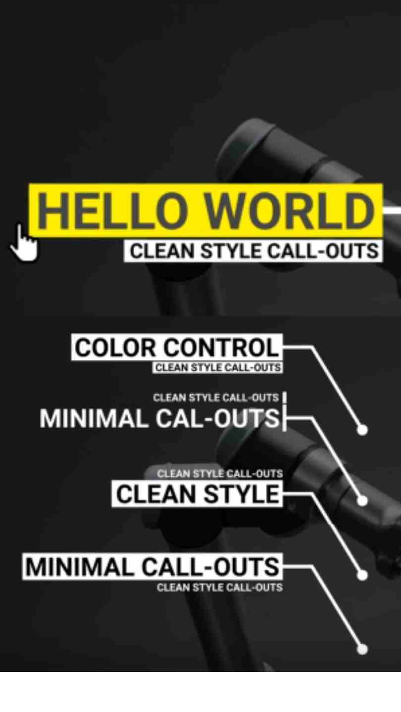
Minimal Call-Outs by ToresMotion, a clean Premiere Pro MOGRT template for labeling details in your footage. Download on Artlist.
Download FREEDownload NOW!Download On Artlist
Not every piece of on screen text needs to introduce a person, sometimes you just need to point at something specific within the frame and label it clearly. Minimal Call-Outs, made by ToresMotion and available through Artlist, is built specifically for this purpose, clean, understated graphic elements that connect a label directly to a specific point, object, or detail within your footage, delivered as a Premiere Pro Motion Graphics Template.
If you're building this into a broader product demo or explainer project, our Premiere Pro Shortcuts guide is genuinely useful here, since navigating your timeline efficiently while positioning a call-out against moving footage benefits considerably from knowing the right keyboard shortcuts. For music with the kind of clean, informative energy that pairs naturally with explainer and product content, Artlist carries a genuinely strong selection well suited to this exact tone.
Exact resolution, element count, and file size were not independently confirmed at the time of writing beyond the product's confirmed identity. Confirm these specific details directly on the live product page before finalizing a project around exact delivery requirements.
A call-out, in publishing and design terminology, is a short piece of text connected by a line, arrow, or similar graphic element to a specific feature within an image, giving information about that particular detail. In video specifically, this same principle lets you highlight a specific product feature, a location detail, a data point, or any other specific element within your footage that benefits from direct, unambiguous labeling. Unlike a lower third, which introduces a person generally, a call-out points at something genuinely specific, making it a fundamentally different tool serving a fundamentally different communication purpose.
This specificity is exactly why call-outs have become such a consistent staple of product demo videos, explainer content, and educational material, they let you direct a viewer's attention to precisely the right detail at precisely the right moment, rather than relying on narration alone to describe where to look.
Head to the Artlist download page and grab the MOGRT file.
In Premiere Pro, go to Window, then Essential Graphics, and use the Browse tab to install your downloaded template.
Drag the specific call-out style you want to use directly onto your timeline, positioned above your footage at the appropriate moment.
Switch to the Edit tab within Essential Graphics and replace the existing label text with your own, keeping it genuinely concise for maximum clarity.
Adjust the call-out's position directly on your Program Monitor so it accurately points to the specific detail you're highlighting within your actual footage.
Use the Edit tab's color controls to fit your specific brand palette while preserving the template's clean, minimal character.
Play back your timeline to confirm your call-out reads clearly, points accurately, and appears at an appropriate moment relative to your footage.
Once satisfied, export your finished sequence using your project's standard export settings.
For a genuinely useful walkthrough of positioning and animating graphic labels directly inside Premiere Pro, watch How To Create Responsive MOGRTs For Premiere Pro. This is worth watching specifically because it covers how MOGRT controls translate into the actual Premiere Pro editing experience, giving you genuine confidence adjusting this call-out template's positioning and timing directly on your timeline.
The most directly obvious use case, pointing out specific product features clearly during a demo or review video.
Call-outs work well for labeling specific rooms, features, or amenities during a property tour video.
Highlighting specific interface elements, tools, or steps within educational content benefits considerably from clear, direct call-out labeling.
Call-outs help label specific data points or chart elements clearly within data driven video content.
Labeling specific landmarks, points of interest, or geographic details within travel footage benefits from this same direct labeling approach.
Since this template shares a creator and a consistent minimal design language with both Minimal Lower Thirds and Minimal Titles, it's worth considering installing all three MOGRTs into the same Premiere Pro project rather than sourcing call-outs, lower thirds, and title cards from entirely different, visually inconsistent sources. This kind of deliberate, coordinated use across a single creator's cohesive product family produces a considerably more polished, professionally unified final result than mixing visually unrelated graphic styles within the same piece of content.
For editors and studios producing recurring content requiring all three graphic types regularly, standardizing on this specific creator's consistent family of MOGRTs genuinely simplifies your regular Essential Graphics workflow while guaranteeing visual consistency across every future project.
Beyond their core function of directing attention, call-outs genuinely support viewer comprehension in ways that pure narration alone cannot always achieve, particularly for viewers watching with sound muted, a genuinely common viewing pattern across social media and workplace environments specifically. A well placed call-out communicates key information visually and independently of audio, meaning your content remains genuinely comprehensible even when a viewer cannot or chooses not to listen to accompanying narration.
For longer form content specifically, product review videos or extended tutorials running several minutes, it's worth thinking deliberately about call-out frequency across the entire piece rather than only within a single specific scene. Spacing call-outs out reasonably across your video's full duration, rather than clustering many in quick succession early on and then using none for the remainder, maintains a more consistent, considered viewing experience throughout your Premiere Pro timeline.
Since Essential Graphics lets you duplicate an installed MOGRT and edit its text independently for each instance, this template adapts reasonably well to localized versions of the same content, different languages naturally requiring different text lengths for an equivalent label. Confirming your specific translated text still fits comfortably within the template's intended proportions before finalizing a localized version avoids discovering a legibility issue only after your project is otherwise complete.
Using call-out text that's too long for the graphic's intended scale. Keep labels concise for the cleanest, most legible result.
Positioning a call-out's pointer or connecting line inaccurately against moving footage. Confirm the call-out continues pointing accurately throughout its entire on screen duration, not just at its initial appearance.
Overusing call-outs within a single piece of content. Reserve them for genuinely important details worth specifically highlighting, rather than labeling every minor element within a shot.
Forgetting the template is a MOGRT rather than a native project file. All customization happens through Essential Graphics directly in Premiere Pro.
As with any Artlist asset, reviewing the current license terms before using this template within paid client or commercial work is worth doing upfront, particularly for product marketing and commercial demo work where licensing clarity carries genuine weight.
Minimal Call-Outs gives Premiere Pro editors a genuinely clean, dependable way to direct viewer attention to specific details within footage, filling a communication role distinct from lower thirds or full title cards. Understanding call-outs' specific purpose, pointing at something precise rather than introducing something general, and pairing this MOGRT thoughtfully with its broader design family, gets you the most value from this asset across product demos, educational content, and any project needing precise, clear visual labeling.
A lower third generally introduces a person with a name and title. A call-out points at a specific detail, feature, or object within the frame with a direct label.
No, it's a Premiere Pro Motion Graphics Template, fully editable within the Essential Graphics panel.
Product demos, real estate walkthroughs, educational tutorials, data visualization, and travel content all genuinely benefit from clear, direct call-out labeling.
Reserve them for genuinely important details worth specifically highlighting rather than labeling every minor element, overuse can overwhelm rather than inform a viewer.
Yes, and it's genuinely worth doing, since both share a consistent visual language that produces a more unified, professional looking finished project.
Affiliate Disclosure: This post may contain affiliate links. If you make a purchase through one of these links, FreeVisuals may earn a commission at no extra cost to you. We only recommend products and platforms we genuinely believe in. Read our full disclosure policy.