Affiliate Disclosure: This post may contain affiliate links. If you make a purchase through one of these links, FreeVisuals may earn a commission at no extra cost to you. We only recommend products and platforms we genuinely believe in. Read our full disclosure policy.
22 Free Mega Cinematic LUT Pack: Professional Colour Grades for Premiere Pro, DaVinci Resolve, Final Cut Pro and After Effects
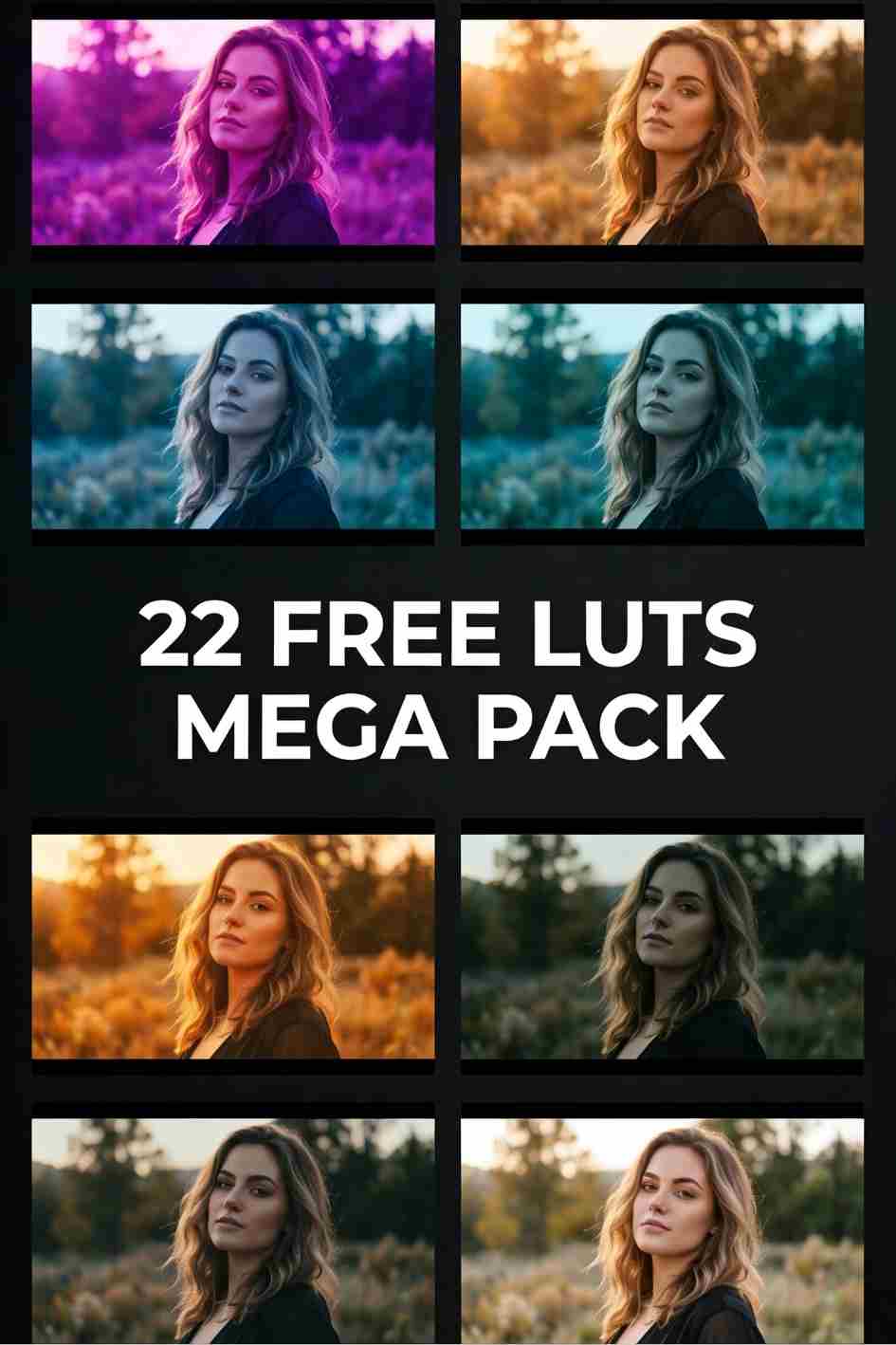
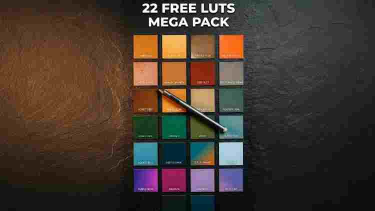
Download the free Mega LUT Pack containing 22 unique cinematic colour grades including 80s Style, Teal and Orange, Sunrise, Sunset, Nightclub, Supernatural, Marine, Mystic and more. Free .cube files for Premiere Pro, After Effects, Final Cut Pro and DaVinci Resolve. Commercial use included, no attribution required.
Download the free pack using the button above. All 22 LUTs are delivered as universal .cube files compatible with every major editing application. Load them into your software in under five minutes and use them on any project, commercial or personal, without restriction.
22 Colour Grades, One Free Download
Most LUT packs try to do one thing well. They pick a single aesthetic, build a set of variations around it, and leave you to fill in the gaps from other packs. The Mega LUT Pack takes a different approach. Twenty-two distinct colour grades, each built around its own visual identity, covering the full range from warm vintage film looks to cool cinematic grades, from neon nightlife aesthetics to natural landscape tones, from abstract experimental colour to honest everyday skin-flattering grades.
Whether you are editing a travel vlog, a music video, a documentary, a social media reel, or a client brand film, at least two or three grades in this pack will be the right starting point for the footage in front of you. That versatility is the defining value of a mega pack, and at a price of zero with full commercial use included, it is one of the most practically useful free assets available for video editors and photographers working today.
Download the full pack using the button above and load all 22 LUTs into your editor of choice in under five minutes. The .cube format is universally compatible with Premiere Pro, After Effects, Final Cut Pro, DaVinci Resolve, Lightroom Classic, and every other professional editing application that accepts .cube files.
A good LUT does not change what you shot. It reveals what you meant when you shot it.
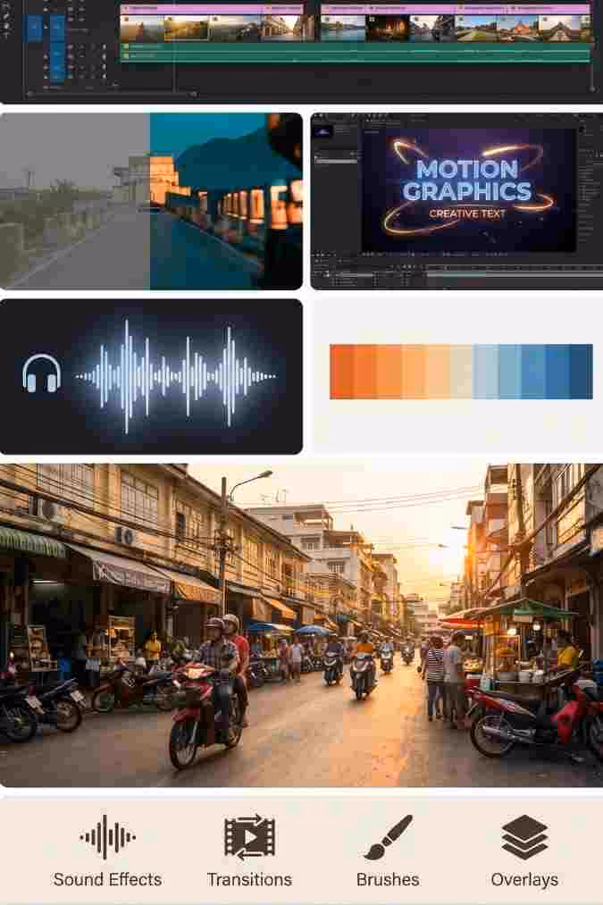
How to Install These LUTs in Your Editing Software
All 22 LUTs are delivered as .cube files. Here is exactly how to install and apply them in each major application.
How to Use LUTs in Premiere Pro
Open your project in Premiere Pro and create an Adjustment Layer above your footage clips in the timeline.
With the Adjustment Layer selected, open the Lumetri Color panel from the Color workspace or via Window, Lumetri Color.
Click on the Creative tab within the Lumetri Color panel.
In the Look dropdown, click Browse and navigate to the folder where you saved the downloaded .cube files.
Select the LUT you want to apply. It will preview in the program monitor as you hover over it.
Click to apply. Use the Intensity slider below the Look dropdown to dial back the strength of the grade to taste. 70 to 80 percent is a good starting point for most grades.
Apply primary correction in the Basic tab first if needed before adjusting the LUT intensity.
Open your project in DaVinci Resolve and navigate to the Color page.
Right-click anywhere in the LUT browser on the left side of the Color page and select Open File Location.
Copy your downloaded .cube files into the LUTs folder that opens. On Mac the default path is /Library/Application Support/Blackmagic Design/DaVinci Resolve/LUT/ and on Windows it is C:\ProgramData\Blackmagic Design\DaVinci Resolve\Support\LUT\.
Back in DaVinci Resolve, right-click in the LUT browser and select Refresh to load the new files.
In the Color page timeline, select the clip you want to grade and add a Serial node.
Right-click on the node and select LUTs. Your imported files will appear in the list. Click the LUT you want to apply.
Alternatively, drag the LUT directly from the LUT browser onto the node in the node editor.
Create an Adjustment Layer above your footage in the After Effects composition timeline.
With the Adjustment Layer selected, go to Effect, Color Correction, Apply Color LUT.
In the Effect Controls panel, click the folder icon next to the LUT dropdown and navigate to your downloaded .cube file.
The LUT will apply to everything below the Adjustment Layer in the composition.
To reduce intensity, reduce the Opacity of the Adjustment Layer or apply the Lumetri Color effect instead, which gives you the same intensity slider as Premiere Pro.
Note that Lightroom does not import .cube files directly. You need to convert them to .xmp preset format first.
To convert: open the Color Grading panel in the Develop module, then go to the Profile Browser at the top of the right panel. Click the four-square grid icon to open the browser.
At the bottom of the Profile Browser, click Import Profiles and navigate to your .cube files. Lightroom will convert and import them automatically.
Once imported, find them in the Profile Browser under the User Profiles category and click to apply.
For stock photography to test these grades on, Shutterstock has an extensive library of high-resolution landscape, portrait, and lifestyle photography. Strong tonal range in your source image produces the most impactful LUT results
Primary Correction First: The Most Important Rule in Colour Grading
The single most important thing you can do before applying any LUT from this pack is sort out your primary correction first. Get your exposure within a stop of where it needs to be. Address any strong colour casts from mixed lighting. Make sure your highlights are not clipped and your shadows have some visible detail.
LUTs work with the image you give them. A well-exposed, balanced image will take any grade in this pack far better than raw, unprocessed camera footage. This is not about spending hours on every clip. A one-minute primary correction pass using the Lumetri Basic controls in Premiere Pro or the Lift, Gamma and Gain wheels in DaVinci Resolve is enough to ensure every LUT in the pack performs at its best.
A good starting workflow is: primary correction on a clip or adjustment layer, then a creative LUT on a separate adjustment layer above it at 70 to 80 percent intensity, then any final tweaks on a third layer above that. This three-layer approach keeps every stage independently adjustable without affecting the others.
All 22 LUTs: What Each One Does and When to Use It
01. 80S STYLE
The 80s Style LUT pushes footage toward the bold, saturated, slightly high-contrast quality of analogue film from the 1980s. Think VHS-adjacent but cleaned up, with punchy reds, slightly lifted blacks, and a warmth to the midtones that references the colour science of period film stocks. Skin tones pick up a warm, slightly heightened quality that references the idealised look of 80s commercial and fashion photography.
Best used for: retro-themed content, nostalgic personal narrative, music videos with a synthwave or retrowave aesthetic, fashion content inspired by the 80s era, and any content where you want to reference the visual culture of that decade without going to a full VHS degradation effect.
Stacks well with: Faded Film at 30 percent for a more worn, analogue quality, or Sunrise for a warmer retro feel.
80s Style
02. ANGLEO
Angleo is an angular, high-contrast grade with a cool-leaning colour shift that gives footage a sharp, precise quality. The name suggests an edgy, geometric sensibility and the grade delivers on that, producing images that feel controlled and intentional. Midtones sit in a slightly cooler territory while highlights stay relatively neutral, giving a clean but not clinical result.
Best used for: urban photography, architecture, contemporary brand content, editorial fashion, and any content where a precise, modern aesthetic is the goal. Works well on footage with strong geometric elements in the frame.
03. BEACH
Beach is a warm, bright, slightly desaturated grade that references the washed-out quality of footage shot in strong coastal sunlight. Highlights are slightly pushed, whites are clean but not clinical, and the overall image has a relaxed, holiday quality. Blues in water and sky pick up a slightly more vivid treatment while warm sand and skin tones stay natural and flattering.
Best used for: travel content in coastal locations, summer lifestyle content, holiday and vacation footage, social media content with a warm outdoor aesthetic, and any footage where the environment contains water, sky, and warm surfaces.
04. BUSHFIRE
Bushfire is a dramatic, high-contrast grade with strong warm orange and amber tones in the highlights and deep, slightly crushed blacks. The grade references the visual quality of firelight and smoke, with a richness and heat in the warm areas and a density in the shadows that gives footage a powerful, intense quality.
Best used for: dramatic outdoor content, nature documentaries dealing with fire or extreme environments, action sports footage, motivational content, and narrative video where the visual tone needs to communicate intensity and raw elemental force.
05. CYPRUS
Cyprus is a warm Mediterranean grade. Golden sun, earthy tones, clear blues in sky and water, and a richness across the midtones that references the quality of light in southern European coastal environments. The grade is travel-friendly and flattering on a wide range of skin tones, giving footage a polished, aspirational quality.
Best used for: travel content in Mediterranean, Middle Eastern, or similarly warm and sunny environments, tourism and hospitality brand content, lifestyle content with a warm European aesthetic, and real estate or architecture footage in sunny climates.
06. DAWN
Dawn is a soft, cool-to-warm transitional grade that references the quality of early morning light before the sun is fully up. The image has a slightly hazy, soft quality with muted colours in the cooler areas and a gentle warmth in the highlights where the early sun touches surfaces. The overall feel is calm, quiet, and considered.
Best used for: peaceful, contemplative content, nature and landscape footage shot at sunrise, personal narrative and documentary content with a quiet or introspective tone, and lifestyle content where the mood is morning calm rather than high-energy.
The name is honest and self-aware, and the grade itself has a pleasingly experimental quality. It sits in an unusual colour territory that is difficult to categorise precisely, which is exactly the point. The grade produces results that feel distinctive and unexpected without being aggressively stylised. The colour shift is subtle but noticeable, giving footage a quality that an audience registers as different without being able to articulate exactly why.
Best used for: experimental and creative video content, art films, personal projects where distinctiveness matters more than convention, music video content that wants a visual signature that does not reference established aesthetic categories, and creators who want their content to look like nothing else in their niche.
08. ILLUSION
Illusion pushes the image into a slightly dreamlike territory with a colour shift that creates an optical quality, as if the footage is slightly more vivid and slightly less real than normal. Colours have a heightened quality and the grade produces results that reference the visual language of fantasy, magic, and altered states.
Best used for: music videos with a surreal or fantastical tone, narrative content with dream sequences or supernatural elements, dance and performance content, experimental social media content that wants to stand out visually, and any project where the visual language should signal that what is seen is not entirely ordinary.
09. LCD
LCD references the cold, blue-shifted quality of liquid crystal display screens and digital interfaces. The grade is cool, slightly flat in contrast, and has a technological, digital aesthetic that references surveillance footage, computer interfaces, and the visual language of digital environments. It is a niche grade but extremely effective in the right context.
Best used for: tech content, cyberpunk and sci-fi narrative, gaming content that wants a digital or interface aesthetic, corporate technology brand films, and any content that wants to reference the visual world of screens, data, and digital systems.
10. MARINE
Marine is a rich, deep blue-green ocean grade. The blue and teal channels are boosted and the warm tones are restrained, producing footage that feels submerged in cool, clear water. Sky takes on a deep vivid blue quality and any water in the frame becomes richly saturated and jewel-like. The grade references the visual quality of underwater documentary and coastal cinematography.
Best used for: ocean and coastal footage, underwater content, travel content in aquatic environments, nature documentary, and any content where blue water, sky, and coastal landscapes are the primary visual subject.
Marine
11. MESSY
Messy is an intentionally rough, textured grade with irregular colour characteristics that give footage a raw, unpolished, slightly chaotic quality. It is the anti-grade in the sense that it deliberately moves away from the clean, considered aesthetic of most cinematic grades toward something that feels accidental and real.
Best used for: punk and DIY aesthetic content, underground music and culture coverage, street photography converted to video, behind-the-scenes and candid content where imperfection is the point, and any content where the visual language should feel like it was not supposed to look this way but does.
12. METALIC
Metalic (as named in the pack) is a cool, slightly desaturated grade with a silvery metallic quality to the highlights and a precision in the image that references the visual language of steel, chrome, and polished industrial surfaces. The grade is clean and hard-edged, with a modernity that suits premium industrial and technology content.
Best used for: automotive content, industrial photography, technology product videos, architecture and infrastructure footage, and any content where the visual language of metal, precision, and modernity is relevant.
Metallic
13. METRO
Metro is an urban grade with a cool, slightly gritty quality that references the aesthetic of city environments, public transport, and the texture of urban life. The grade pushes toward a muted, somewhat desaturated palette with slightly elevated contrast that gives city footage a documentary, journalistic quality.
Best used for: urban documentary, street photography and videography, city travel content, commuter and transit footage, and any content dealing with the texture and energy of modern urban environments.
14. MYSTIC
Mystic pushes footage into a deep, atmospheric territory with rich shadows, slightly desaturated midtones, and a colour shift that introduces a mysterious, otherworldly quality. The grade references the visual language of forest fog, deep shadow, and the kind of light that appears in environments that feel ancient or unknown.
Best used for: fantasy and supernatural content, forest and nature footage with a moody or atmospheric tone, horror and thriller visual content, personal narrative with an introspective or searching quality, and any content where the visual language should communicate the unknown and the hidden.
Nightclub is an unapologetically bold grade built for content shot in nightlife environments. It boosts the vivid artificial colours of club lighting, neon signs, and LED-lit spaces while crushing the blacks to give the dark areas of the image depth and density. The result is footage that looks like it was shot at the best moment of a night out, with vivid colour and energy.
Best used for: nightlife and event coverage, music videos shot in club or bar environments, DJ content, party and celebration footage, and social media content with an energetic nightlife aesthetic. Pairs extremely well with the Neon Nights LUT from the Cinematic Pack for an even more saturated result.
Nightclub
16. SKIN
Skin is a practically focused grade built around flattering and optimising skin tones specifically. Where most grades are built around a mood or aesthetic and hope the skin tones survive the process, Skin is built from the skin outward. The result is footage where subjects look healthy, warm, and well-lit regardless of the quality of the original lighting.
Best used for: portrait video, talking head and interview content, vlog content, beauty and cosmetics video, and any content where the primary subject is a person and the most important thing is that they look their best on screen.
17. STOLEN
Stolen has the feeling of a colour grade lifted from a specific high-end production, a grade that feels borrowed from a reference film or commercial. The aesthetic is polished and cinematic with a deliberate, referenced quality that gives footage a sense of having been treated with real care and craft. The specific colour direction is cool-leaning with strong contrast and a film-stock quality in the grain of the highlights.
Best used for: short films, music videos that want a cinematic quality, high-end brand content, and any project where the editor wants the grade to quietly signal serious production values.
18. SUNRISE
Sunrise is a warm, soft grade that replicates the quality of early morning sunlight when the sky is pale gold and the air has a gentle haze. The highlights are warm amber, the shadows are soft and lifted, and the overall image has a hopeful, beginning-of-the-day quality that is both visually flattering and emotionally resonant.
Best used for: morning lifestyle content, motivational and aspirational video, travel footage in warm environments, wedding morning preparation footage, and social media content that wants a fresh, optimistic visual tone. One of the most universally flattering grades in the pack for general-purpose lifestyle use.
Sunrise
19. SUNSET
Sunset takes the warmth of Sunrise and pushes it further, deeper, and more saturated. Where Sunrise is gentle and beginning, Sunset is rich and concluding. The highlights are deeper amber, the shadows hold more warmth, and the whole image has a saturated golden quality that references the most photogenic end-of-day light.
Best used for: golden hour travel content, wedding videography, lifestyle content shot in warm evening light, social media content with a rich warm aesthetic, and any footage where the visual language should communicate warmth, completion, and the beauty of the world at its most photogenic moment.
Supernatural is a stylised grade with a distinctive colour shift that references the visual language of the paranormal, the uncanny, and the extraordinary. The grade introduces unusual colour characteristics that make footage feel like something about the scene is not quite normal, a visual signal of the presence of something beyond the ordinary.
Best used for: supernatural and horror narrative content, paranormal and conspiracy documentary, music videos with a dark or supernatural theme, and any content where the visual language should signal that what is being shown exists at the edge of the ordinary world.
21. THIS LUT DOESN'T LOOK GOOD
The most honestly named grade in the pack. This LUT produces a deliberately wrong and broken colour result that sits in a very specific creative space between intentional ugliness and accidental art. It is not for every project or every editor, but in the right context, a grade that looks wrong is exactly the right choice.
Best used for: experimental video art, lo-fi and anti-aesthetic content, glitch and broken aesthetic music videos, internet art and meme culture content, and any project where the conventional rules of good colour grading are the thing being deliberately broken. Surprisingly effective on punk, hardcore, and experimental music content.
22. WEIRD LOOKING COLOUR
The second of the self-aware experimental grades in the pack. Weird Looking Colour produces a distinctive result that sits outside the familiar categories of cinematic grading. The colour shift is genuinely unusual and produces results that are harder to predict on different types of footage, which makes it a grade for experimentation rather than consistent production use.
Best used for: art projects, experimental personal work, content that wants to provoke a reaction through visual difference, and creators who want to develop their own visual signature by taking an unusual starting point and developing it further with additional colour work.
Combining LUTs from the Pack for the Best Results
With 22 grades available, combining two at lower opacities is where some of the most interesting results come from. Here are five combinations worth trying.
Sunrise plus Beach at 60 and 40 percent creates a warm, bright outdoor grade that is one of the most flattering combinations for travel content in any warm environment.
Nightclub plus LCD at 65 and 35 percent produces a vivid, technology-meets-nightlife combination that suits electronic music content and gaming highlight reels.
Dawn plus Marine at 55 and 45 percent creates a cool, calm, coastal morning grade that works beautifully on ocean and coastal travel footage.
Mystic plus Stolen at 60 and 30 percent produces a polished, atmospheric cinematic grade with a slightly mysterious quality that suits short film and narrative content.
80s Style plus Sunset at 50 and 50 percent creates a rich, warm retro grade that gives lifestyle and social media content a nostalgic quality while keeping the energy of the 80s reference alive in the highlights.
How These LUTs Work Best: Primary Correction First
The single most important thing you can do before applying any LUT from this pack is sort out your primary correction first. Get your exposure within a stop of where it needs to be. Address any strong colour casts from mixed lighting. Make sure your highlights are not clipped and your shadows have some visible detail.
LUTs work with the image you give them. A well-exposed, balanced image will take any grade in this pack far better than raw, unprocessed camera footage. This is not about spending hours on every clip. A one-minute primary correction pass using the Lumetri Basic controls in Premiere Pro or the Lift/Gamma/Gain wheels in DaVinci Resolve is enough to ensure every LUT in the pack performs at its best.
For premium templates, motion graphics, and professional assets to use alongside these LUTs in your projects, Envato Elements has a library of over 26 million assets across video, audio, design, and code.
Frequently Asked Questions
Are all 22 LUTs free for commercial use?
Yes. Every LUT in the Mega LUT Pack is free to download and use in personal and commercial projects with no attribution required.
What file format are the LUTs?
All LUTs are provided as .cube files, the industry standard format supported by every professional editing application including Premiere Pro, After Effects, Final Cut Pro, DaVinci Resolve, Lightroom Classic, Vegas Pro, and HitFilm.
Do these LUTs work on LOG footage?
These are creative LUTs designed for Rec.709 footage. If you are shooting in a LOG or flat picture profile, apply a technical conversion LUT to bring your footage to Rec.709 first, then apply one of these creative grades on top. Most camera manufacturers provide free technical LUTs on their websites.
What opacity should I start with?
70 percent is a good general starting point. Some grades like Sunset, Sunrise, and Beach benefit from being used closer to full strength at 80 to 90 percent. The experimental grades like IDKWHATCALLTHIS, Weird Looking Colour, and This LUT Doesn't Look Good often work best at 40 to 60 percent where their unusual characteristics are present but not overwhelming.
Can I use these in CapCut?
Yes on CapCut Desktop, which has full .cube LUT import support. CapCut on mobile does not currently support direct .cube file import.
Will these work in DaVinci Resolve?
Yes. In the Color page, right-click on a node and select LUTs to import the .cube file, or browse to it via the LUT browser panel on the left side of the Color page.
Can I combine LUTs from different packs?
Yes. LUTs from this pack combine well with the FreeVisuals Cinematic LUT Pack. The Sunset and Golden Hour grades from both packs stack particularly well together for warm lifestyle content.
Compatible Software
Adobe Premiere Pro, Adobe After Effects, Final Cut Pro X, DaVinci Resolve, Adobe Lightroom Classic, Vegas Pro, HitFilm, Avid Media Composer, CapCut Desktop, LumaFusion on iPad, and any other application that accepts standard .cube format LUT files.
.avif)


.avif)
.avif)
.avif)
.avif)
.avif)


