.avif)
Freevisuals
%2520(1).png)
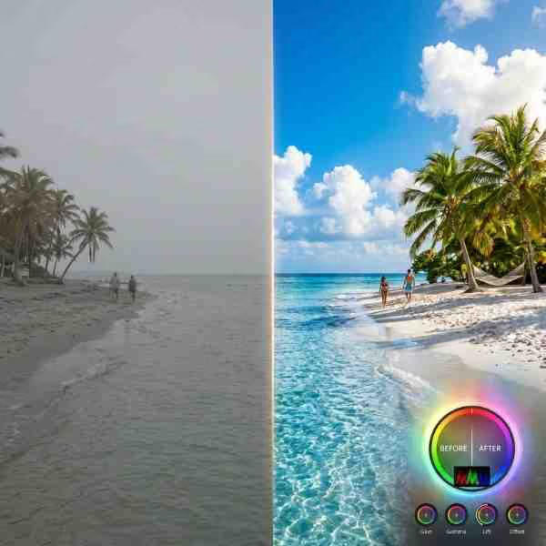
Download this free 'Blue Boost' color grading preset for Adobe After Effects, improve the color scheme and mood of your scene by adding a cool blue tint.
Download FREEGo Pro To DownloadDownload NOW!Download this FREE 'Blue Boost' color grading/color correction look preset for Adobe After Effects. Improve the color scheme and mood of your scene by. Built for Adobe After Effects, Blue Color Grading Preset gives editors a ready-to-apply preset rather than requiring a custom build from scratch.
If you're building a broader project around this preset, browse our After Effects colour presets for additional options to pair with it, and for music to underscore your project, Artlist and Epidemic Sound both carry a wide range of tracks well suited to most editing contexts.
Whether you're producing content on a regular publishing schedule or working on a single standalone project, Blue Color Grading Preset is built to slot into your existing Adobe After Effects workflow without requiring you to rebuild familiar steps from scratch, giving you one less decision to make from zero on your next edit.
Every element listed above is included directly in the download, ready to apply within Adobe After Effects without needing to source additional files or plugins separately. This matters for keeping your project setup simple, since a preset that depends on several separate, hard-to-find components tends to introduce far more friction into a workflow than one delivered as a single, self-contained package like Blue Color Grading Preset.
Delivered as a lightweight, self-contained file, Blue Color Grading Preset adds minimal overhead to your project regardless of your specific computer's processing power, meaning even editors working on more modest hardware can apply and preview it without significant slowdown, an important practical consideration alongside the purely creative benefits this preset provides.
A well-built preset, built specifically around blue boost, solves a genuinely recurring problem for editors, the same visual or technical decision showing up project after project, without needing to rebuild the underlying work from scratch every single time. Rather than manually recreating this specific look or effect by hand for every new video, having it available as a ready-to-apply preset turns what might otherwise be a repeated, time-consuming task into something closer to a single click, freeing up meaningful time for the parts of editing that genuinely benefit from fresh creative attention.
This matters more than it might initially seem for anyone producing content on a regular schedule. Small, repeated production tasks add up considerably over a busy month of editing, and a reliable preset like this one removes one of those recurring tasks from the list entirely, letting Blue Color Grading Preset become a dependable part of a broader, more efficient production pipeline rather than something reinvented from scratch on every single project.
Creators wanting a consistent, distinctive color mood across their regular uploads benefit from a preset like this applied consistently across every video. Applying Blue Color Grading Preset consistently across this kind of content helps build a recognizable, considered visual identity rather than a one-off effect used in isolation.
Independent filmmakers can use this preset as a fast starting point for establishing a specific visual tone before fine-tuning further. Since this preset is genuinely reusable, it's worth keeping in mind as a default option any time a similar project comes up in your regular Adobe After Effects workflow.
Music videos looking for a bold, stylized color mood can apply this preset as a foundation before layering additional creative grading on top. Editors working in this specific content category benefit from the time this preset saves compared to building a similar result manually for every new project.
Short-form vertical content benefits from a quick, consistent color treatment that reads clearly even at a smaller screen size. This use case in particular rewards the consistency a ready-made preset like this one makes genuinely practical across a larger body of work.
Businesses producing regular marketing content can use this preset to maintain a consistent visual identity across every piece of video output. Considering how this preset fits alongside your other production choices for this specific content type helps ensure the final result feels cohesive rather than disconnected.
Most finished projects in Adobe After Effects involve stitching together a whole series of individual decisions, footage selection, pacing, color, sound, text, and a preset like this one represents just one piece of that larger puzzle. Understanding where it fits within that broader sequence of decisions, applied early enough to inform how surrounding elements are chosen, but not so early that it locks in choices before the rest of a project has taken shape, tends to produce a more considered, cohesive final result than treating it as an afterthought bolted on at the very end of an edit.
For editors working through a typical Adobe After Effects project, it's often worth applying Blue Color Grading Preset at a reasonably early stage, once your rough cut is in place but before final color and sound design begins, so the rest of your creative decisions can be made with this specific preset already factored into the overall look and feel you're building toward.
Head to the download page and grab the preset file.
In After Effects, go to Edit > Preferences (or After Effects > Settings on macOS) to confirm your default presets folder location, or simply keep the downloaded file in a dedicated project assets folder.
Open the Effects & Presets panel in After Effects, then drag the downloaded .ffx file directly into the panel, or double-click it to load it automatically.
Select the footage, adjustment layer, or composition you want to apply the preset to.
Drag the preset from the Effects & Presets panel directly onto your selected layer.
With your layer selected, open the Effect Controls panel to fine-tune the preset's specific parameters.
Scrub through your timeline to confirm the effect reads well across your specific footage.
Reduce or increase the effect's strength through the Effect Controls panel until it feels balanced against your footage.
If you've made specific adjustments you want to reuse, save your customized version as its own new preset for future projects.
Once you're happy with the result, render and export using your project's standard delivery settings.
Following these steps in order, rather than skipping ahead to the customization stage before confirming the preset is correctly installed and appearing where expected within Adobe After Effects, avoids the most common source of frustration when working with any new template or preset file for the first time. Once you've been through this process once with Blue Color Grading Preset, applying it to future projects becomes considerably faster, since the initial installation and familiarization step only needs to happen a single time.
One of the most valuable qualities a preset can offer is consistency, the ability to produce a broadly similar, reliable result across different footage, different lighting conditions, and different specific projects, rather than requiring significant readjustment every single time it's applied. Blue Color Grading Preset is built with this kind of consistency in mind, meaning creators who apply it across a whole body of work, a full channel, a full wedding season, a full campaign, can reasonably expect a cohesive result without needing to recalibrate from scratch for every individual piece.
This consistency has real practical value beyond simple convenience. A body of work that shares a consistent visual or technical treatment reads as more considered and professional to an audience than a collection of individually inconsistent pieces, even when the underlying content quality is otherwise comparable. Applying this preset deliberately and consistently, rather than only occasionally, is part of what turns a useful individual asset into a genuine contributor to an overall recognizable style.
Most of these mistakes share a common thread, moving too quickly through the application process without taking a moment to preview and confirm the result actually suits the specific footage or project at hand. Building a habit of a quick, deliberate preview before finalizing any use of Blue Color Grading Preset, rather than assuming the default settings will automatically work for every situation, is a small habit that meaningfully improves the consistency of your finished results over time.
The technical difference between a preset applied thoughtfully and one applied carelessly often comes down to a handful of small, easily overlooked decisions, whether the effect's intensity genuinely suits the specific footage it's applied to, whether its timing is calibrated to the actual pacing of the surrounding edit, and whether it's used consistently enough to feel intentional rather than applied inconsistently from clip to clip. Blue Color Grading Preset provides the underlying technical foundation, but these final calibration decisions remain genuinely important for the finished result to feel considered rather than default.
Taking the small amount of extra time these calibration decisions require, rather than accepting Blue Color Grading Preset's default settings uncritically across every single use, is precisely the kind of detail that separates work that reads as genuinely professional from work that merely uses professional-grade tools without fully considering how they're actually applied to the specific project at hand.
Visual and technical trends within video editing shift meaningfully over time, and it's worth considering whether Blue Color Grading Preset's specific approach represents a genuinely durable technique or one tied more closely to a passing stylistic moment. Effects and techniques grounded in solid underlying production principles, clear communication, considered pacing, technically sound execution, tend to remain useful considerably longer than those built purely around a specific trending aesthetic that risks feeling dated within a relatively short period.
This particular preset leans toward the more durable end of that spectrum, built around genuinely useful Adobe After Effects technique rather than a narrow, trend-specific look alone, which is part of why it's likely to remain a reasonable addition to a working toolkit well beyond any single specific editing trend cycle. That said, periodically reassessing whether any specific asset in your toolkit still serves your current work is a healthy habit regardless of how durable any individual asset might be.
Weighing the genuine strengths and limitations of any preset before committing to it across a full project helps set realistic expectations rather than discovering a mismatch partway through an edit. Blue Color Grading Preset is no exception, it does its specific job well, but understanding exactly where it excels and where its limitations lie helps you apply it with appropriate confidence rather than either over-relying on it in situations it wasn't built for, or underusing it out of unnecessary caution in situations where it would genuinely help.
Adobe After Effects. Check the specific download page for the exact version requirement.
Yes, directly through the Effect Controls panel once the preset is applied to your layer.
Yes, free for both personal and commercial projects.
It's built for broad compatibility, though always preview against your specific footage since results can vary depending on original lighting and color.
No, it's built to work natively within After Effects.
Yes, it works well as a foundation you can layer further manual correction on top of.
Blue Color Grading Preset is a simple, genuinely useful addition to a Adobe After Effects workflow, the kind of preset that quietly saves time on a recurring basis rather than serving as a flashy, one-time feature. For creators building a regular content production schedule, having a reliable set of these kinds of assets on hand, rather than rebuilding similar effects from scratch on every new project, is a genuinely meaningful part of working efficiently without sacrificing the polish a finished project deserves. Download it, spend a few minutes getting familiar with its specific controls, and it should earn a lasting place in your regular toolkit alongside the rest of your go-to Adobe After Effects assets.
Whichever specific way you end up using Blue Color Grading Preset, the underlying principle worth carrying forward is treating a well-built preset as a genuine part of your working toolkit rather than a novelty tried once and forgotten, since that's ultimately where assets like this one deliver their real, compounding value over an entire body of work rather than any single isolated project.
No single preset is the right fit for absolutely every project, and it's worth having a couple of genuinely different options on hand for situations where Blue Color Grading Preset isn't quite the right match. The following are worth bookmarking alongside this download, whether you need a different stylistic direction for a specific project, complementary music and sound to round out your Adobe After Effects edit, or additional visual assets to build out a fuller production.
Affiliate Disclosure: This post may contain affiliate links. If you make a purchase through one of these links, FreeVisuals may earn a commission at no extra cost to you. We only recommend products and platforms we genuinely believe in. Read our full disclosure policy.
Download free video templates, LUTs, and presets for Premiere Pro, After Effects, DaVinci Resolve, CapCut, and Final Cut Pro.


%20Profile%20Pic.jpg)