.avif)
Freevisuals
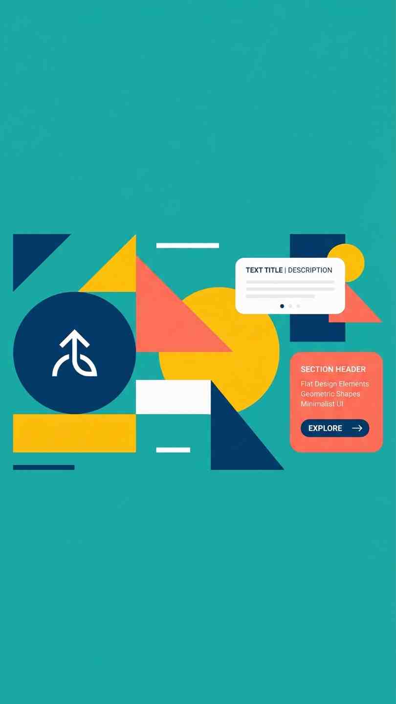
Flat Style Text Reveal, a clean geometric flat design After Effects text animation template. Free download on MotionElements for edits.
Download FREEGo Pro To DownloadDownload NOW!Flat design has stayed genuinely relevant in motion graphics for a reason that has little to do with passing trends, clean shapes, bold color blocks, and geometric precision translate directly into text animation that reads clearly at a glance and scales cleanly across virtually any resolution or platform. Flat Style Text Reveal, available through MotionElements, is built around exactly this aesthetic, a text animation template using clean geometric motion rather than photorealistic texture, blur, or organic movement to reveal your on screen text.
If you're building this into a broader flat design project, our Scale Proportionally tutorial is genuinely useful here, since flat design's geometric shapes depend heavily on clean, undistorted scaling to maintain their crisp, precise character. For music with the kind of upbeat, modern energy that complements flat design's contemporary aesthetic, Artlist carries a genuinely strong catalogue well suited to this exact style.
Exact resolution, precise duration, and file size were not independently confirmed at the time of writing since MotionElements' listing pages require JavaScript to load full specifications. Confirm these specific details directly on the live product page before finalizing a project around exact delivery requirements.
Flat design's core principle, representing information through clean shapes and solid color rather than gradients, shadows, or photorealistic texture, translates particularly well into text animation specifically because it prioritizes legibility above all else. A geometric reveal, a shape sliding away to expose text, a color block resolving into a solid backdrop, communicates clearly and reads instantly regardless of a viewer's screen size or the specific platform they're watching on, from a large presentation display down to a small mobile phone screen.
This clarity is exactly why flat design has remained a consistently reliable choice across UI design, branding, and motion graphics for years, rather than fading as a passing trend the way more texture heavy or photorealistic styles sometimes do. A flat style text reveal specifically brings this same reliability directly into your title and text animation work, without requiring you to constantly refresh your visual approach to keep pace with faster moving stylistic trends.
Head to the MotionElements download page and grab the project files.
Open the .aep file directly in After Effects and allow the project to fully load.
Before editing, take a moment to understand how the template's geometric shapes and color blocks are organized, since flat design templates typically rely on a clear, layered shape hierarchy.
Double click into the text layer and replace the existing copy with your own.
Update the template's solid color blocks to match your specific brand palette, since flat design's visual impact depends heavily on confident, well chosen color choices.
If you adjust scale at any point, confirm your geometric shapes remain proportionally correct rather than becoming visibly stretched or distorted.
Use RAM Preview to confirm your finished reveal reads clearly and at an appropriate pace.
Bring your finished title into your main project timeline and render using your standard export settings.
For a genuinely relevant walkthrough of building this exact style of geometric flat design title reveal, watch Geometric Flat Design Title Reveal In After Effects. This is worth watching specifically because it covers the underlying motion design principles this template is built around, clean shape based transitions, confident color blocking, and the specific kind of geometric precision that separates a genuinely convincing flat design reveal from one that merely uses flat colors without the underlying structural discipline the style actually depends on.
Flat design's origins in interface design make this reveal style a particularly natural fit for app demos and software walkthrough content.
The clean, modern aesthetic suits business content wanting genuine polish without unnecessary visual complexity.
Flat design's clarity focused approach suits educational content specifically, where legibility and clear information hierarchy matter more than decorative flourish. This makes it a genuinely dependable choice for tutorial videos, online courses, and any content where a viewer's actual comprehension of the material matters more than decorative visual flair.
The geometric, structured nature of flat design pairs naturally with content built around presenting clear, organized information.
Tech focused brands specifically benefit from flat design's genuinely contemporary, digitally native visual language, since this style originated directly from interface and product design rather than traditional broadcast motion graphics, giving it an inherent credibility with audiences already familiar with modern software and app interfaces.
Many motion graphics trends cycle in and out of relevance relatively quickly, but flat design has proven considerably more durable than most, largely because its underlying logic, clarity and legibility above decorative complexity, remains genuinely useful regardless of shifting stylistic fashion. A flat style text reveal built today is considerably less likely to feel dated in a few years compared to a heavily trend specific visual treatment tied to a passing aesthetic moment, making it a genuinely sound long term investment for creators and brands wanting content that remains visually relevant well beyond its initial publication.
Mixing flat design with photorealistic or heavily textured background footage. This creates a visual mismatch that undermines the reveal's clean, geometric character.
Using too many competing colors simultaneously. Flat design generally reads best with a genuinely disciplined, limited color palette rather than an overly busy, multi color composition.
Adding drop shadows or bevels to flat shapes. These effects directly contradict flat design's core visual principle and should generally be avoided entirely within this specific style.
Ignoring proportional scaling when resizing shapes. Distorted geometric shapes read as a genuine visual error within a style built specifically around precision.
Geometric Flat Design Title Reveal In After Effects, a genuinely relevant walkthrough of the shape based transitions and color blocking principles this template's reveal style is built around.
Since flat design depends heavily on visual consistency to achieve its full impact, it's worth treating this template as one component within a broader, deliberately built flat design system rather than an isolated element used once and then abandoned. Establishing a consistent color palette, shape language, and typography choice that carries across this text reveal and any other graphic elements within your broader project produces a considerably more cohesive, professionally considered final result than a single flat design element sitting in isolation against an otherwise inconsistent visual treatment.
This kind of systematic consistency matters particularly for brands and agencies producing content regularly, where a genuinely disciplined visual system, applied consistently across every piece of content rather than reinvented from scratch each time, builds real recognition and trust with an audience over an extended period of ongoing content production and future campaign work.
As with any MotionElements asset, reviewing the current license terms before using this template within paid client or commercial work is worth doing upfront, particularly for tech, startup, or corporate branding work where licensing clarity matters considerably. Confirming your specific intended use case is properly covered protects both your own business and gives your client genuine confidence in the assets underlying their finished deliverable.
This is a worthwhile step regardless of how frequently this template becomes part of your regular workflow, since licensing clarity remains important whether this asset is used once or becomes a recurring part of your standard toolkit.
Since flat design depends so heavily on solid, confident color blocking, it's worth considering color contrast and accessibility specifically when customizing this template's palette for your own brand. Confirming your chosen text and background color combination maintains sufficient contrast, rather than choosing colors purely for aesthetic appeal, ensures your finished reveal remains genuinely legible for the widest possible range of viewers, including those with color vision differences that certain color combinations can affect considerably more than others.
Genuine flat design depends on structural discipline, clean shape based transitions and confident color blocking without shadows, gradients, or textures layered on top, not simply the presence of solid colors alone.
Not universally, it suits professional, educational, tech, and UI focused content particularly well, but may feel too restrained for projects wanting a genuinely decorative or high energy visual treatment.
Generally not recommended, since these additions undermine the core visual discipline flat design depends on for its clean, distinctive character.
Its underlying focus on clarity and legibility rather than decorative complexity remains genuinely useful regardless of shifting stylistic fashion, making it less likely to feel dated over time.
It's built as a standard native After Effects project file, check the live listing directly for any specific plugin requirements before downloading.
Affiliate Disclosure: This post may contain affiliate links. If you make a purchase through one of these links, FreeVisuals may earn a commission at no extra cost to you. We only recommend products and platforms we genuinely believe in. Read our full disclosure policy.

Download free video templates, LUTs, and presets for Premiere Pro, After Effects, DaVinci Resolve, CapCut, and Final Cut Pro.