.avif)
Freevisuals
Free desaturated horror and thriller .cube LUT for Premiere Pro, DaVinci Resolve, FCP and CapCut.
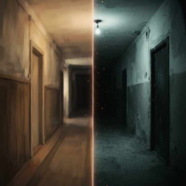
Download FREEHorror and thriller storytelling relies heavily on color psychology to build dread and unease before anything overtly frightening even happens on screen. Horror & Thriller Desaturated is built around that specific visual language, crushed shadows, a sickly green-cyan color cast, and heavy overall desaturation that drains warmth and life from a scene, creating the unsettling, tense atmosphere this genre depends on.
This is the most dramatically stylized, narrative-specific LUT in our library, built purely for creative fiction and genre filmmaking rather than any documentary or lifestyle use case. For music to pair with horror and thriller content, Artlist and Epidemic Sound both carry tense, atmospheric, and suspenseful tracks well suited to this genre.
Format: .cube (33-point 3D LUT), compatible with DaVinci Resolve, Adobe Premiere Pro, Final Cut Pro, and any other software that supports standard .cube LUT files.
Color grading in horror and thriller genres draws on well established psychological associations that filmmakers have refined over decades of genre filmmaking. Green and cyan color casts, in particular, have become closely associated with sickness, decay, and unnatural or supernatural danger, likely tapping into an instinctive human association between these colors and things like mold, disease, and toxic substances, none of which humans are evolutionarily wired to find appealing or safe. Combined with crushed, obscured shadows that hide potential threats just out of clear view, and heavy desaturation that drains the warmth and vitality typically associated with safety and comfort, this color treatment creates a pervasive sense of unease before any explicit horror element even appears on screen.
This LUT is built to recreate this specific, genre-established visual language accurately, giving independent and amateur horror and thriller filmmakers access to the kind of professional color psychology that major studio horror productions have used consistently for decades, without requiring extensive color grading expertise to achieve convincingly.
The core use case this LUT is built for, giving independent horror filmmakers a genre-appropriate color foundation without needing extensive color grading experience.
Thriller content, even without overtly supernatural or violent horror elements, benefits from this LUT's tension-building color psychology.
Found-footage horror and internet creepypasta-style narrative content, popular across YouTube and social platforms, pairs naturally with this LUT's unsettling aesthetic.
Seasonal Halloween content, haunted house documentation, or horror-themed marketing benefits from this LUT's immediately recognizable genre signaling.
Trailers and promotional content for horror video games or interactive media can use this LUT to establish appropriate genre tone in live-action promotional elements.
Download the .cube file from the link above.
Go to File > Preferences > System > General, then click Open LUT Folder. Copy the downloaded .cube file into this folder.
Resolve needs to be restarted, or the LUT list refreshed manually, before the new LUT appears in your browser.
Right-click your clip's node, choose LUT, and select Horror Thriller Desaturated from your custom LUT folder.
Add Lumetri Color to your clip, open the Lumetri panel, go to Creative, click Browse under Look, and select the .cube file directly.
Place the .cube file in your custom LUT folder and apply through the Color inspector.
Since this LUT pushes shadows aggressively toward black, footage shot with reasonable dynamic range, ideally in a flat or log profile, gives you more control over exactly where detail disappears into shadow.
Motivated practical light sources within your scene, flashlights, single bulbs, distant windows, work particularly well with this LUT's crushed shadow treatment, creating pools of light within otherwise obscured darkness.
This LUT's green cast will noticeably affect skin tones, confirm this reads as intentionally unsettling rather than simply looking like an uncorrected white balance error.
Given how much this LUT relies on subtle shadow detail and specific color tone, review your final export on a calibrated display to confirm the intended mood translates accurately.
Applying this LUT uniformly regardless of narrative context. Horror and thriller films still need lighter, calmer moments for pacing and contrast, applying maximum intensity throughout an entire film can fatigue viewers rather than building effective tension.
Shooting without adequate dynamic range for the shadow treatment. Footage that's already low contrast or poorly exposed can look muddy rather than intentionally moody once this LUT's aggressive shadow crush is applied.
Ignoring how the green cast affects makeup and practical effects. If your production includes specific makeup or practical effects work, preview how this LUT's color shift affects those specific elements before committing across a full shoot.
Not testing the LUT's intensity against your specific narrative tone. Some thriller content benefits from a more subtle application of this LUT's characteristics rather than the full, most extreme version, adjust intensity to match your specific project's tone.
For a genuinely thorough breakdown of building this exact style of look from scratch, watch Netflix Thriller Look, DaVinci Resolve Color Grading Tutorial. It walks through building a dark, moody, high tension grade using only native Resolve tools, genuinely useful for understanding the actual color theory behind this LUT, crushed shadows, pulled saturation, a cool cast through the midtones, so you can push the look further or dial it back to suit your specific footage rather than applying it blindly.
While this LUT recreates well established horror and thriller color conventions, the strongest genre filmmaking typically uses these conventions as a foundation for a distinctive voice rather than a rigid formula applied without consideration. Understanding why this color treatment works, the psychological associations with green and decay, the way crushed shadows create a sense of hidden threat, allows filmmakers to make more informed decisions about when to lean fully into these conventions and when to deliberately subvert them for a specific creative effect.
Some of the most memorable and effective horror filmmaking specifically plays against expected genre color conventions at key moments, using unexpectedly warm, saturated color during a moment of false safety before a scare, precisely because audiences have become so accustomed to horror's typical cold, desaturated visual language that a sudden warm moment feels equally unsettling in its own way, a false sense of security about to be violently disrupted. This LUT provides a strong, genre-authentic foundation, but the most effective use of it often involves knowing when to deviate from it just as much as knowing when to apply it at full intensity.
A genuine risk with heavily stylized, desaturated horror grading is that it can sometimes work against basic narrative clarity if pushed too far, viewers need to be able to actually see and understand what's happening on screen, even in a deliberately dark, unsettling scene. Crushed shadows that hide a genuine threat effectively are a powerful storytelling tool, but shadows crushed so aggressively that viewers can't follow basic action or character movement cross the line from tension-building into simple confusion, which works against rather than for the film's actual effectiveness.
Finding the right balance for your specific project often requires testing this LUT's intensity against actual footage and getting outside feedback from viewers unfamiliar with the project, since filmmakers who've watched their own footage repeatedly during editing can lose perspective on whether a shot is genuinely too dark to follow or simply feels that way due to over-familiarity with the specific scene. A few test screenings with fresh eyes, specifically asking whether viewers could follow the action clearly in your darkest, most heavily graded scenes, provides valuable, objective feedback that's difficult to obtain purely through your own repeated review during the editing process.
Horror and thriller content faces a particular exhibition challenge that many other genres don't need to consider as carefully, the viewing environment can dramatically affect how well shadow detail and subtle color grading actually translate to an audience. A carefully calibrated horror grade that looks appropriately dark and moody on a properly calibrated reference monitor can look nearly unwatchable, with important detail completely lost, when viewed on a poorly calibrated laptop screen, a phone in bright daylight, or a budget television with poor black level performance.
Given how many different devices and viewing conditions modern audiences actually use to watch content, particularly for content distributed through streaming platforms or social media rather than a controlled cinema environment, it's worth testing your final graded footage across a genuinely representative range of devices before finalizing, rather than relying solely on a single, ideal reference display. Some horror filmmakers specifically choose to pull back slightly from the absolute darkest, most aggressive version of a shadow-heavy grade specifically to account for this reality, accepting a marginally less extreme look on ideal equipment in exchange for the content remaining watchable and effective across the full realistic range of viewing conditions their actual audience will use.
Independent horror filmmaking occupies a distinctive position within independent film more broadly, it remains one of the more commercially viable genres for low-budget, independent productions specifically because audiences have historically shown willingness to embrace horror content that succeeds on atmosphere and tension rather than requiring the substantial budgets bigger budget genres often demand for convincing visual spectacle. A genuinely effective color grade, like the one this LUT provides, plays a disproportionately important role in this specific context, since it's one of the more affordable ways an independent production can achieve a level of visual polish and genre authenticity that might otherwise require expensive professional color grading services to achieve.
This practical reality is part of why free, high quality genre-specific tools like this LUT genuinely matter for independent filmmakers working with limited budgets, they help level the visual playing field somewhat between well funded studio productions and independent creators working with considerably more constrained resources, allowing creative vision and storytelling ability to matter more than access to expensive professional post-production services.
For emerging horror filmmakers building a portfolio or seeking festival recognition, having access to genuinely convincing, professional-feeling genre color grading from the very start of their filmmaking career removes one meaningful barrier to producing work that can compete visually with better funded productions, even while budget constraints may still limit other aspects of production quality like cast size, locations, or practical effects work.
Visual color grading and sound design work together particularly closely in horror and thriller filmmaking, arguably more so than in almost any other genre, and it's worth considering both elements together rather than treating color grading as an isolated post-production step. This LUT's cold, desaturated, oppressive visual treatment pairs most effectively with equally considered sound design, low frequency rumbles, unsettling ambient tones, and strategic use of silence, rather than a soundtrack that doesn't match the visual tension being established through color alone.
Many horror sound designers specifically time key sound elements, a distant creak, a sudden silence, a low rumble building tension, to coincide with specific visual moments where this kind of color grading is doing its heaviest lifting, creating a combined audiovisual effect that's considerably more powerful than either element could achieve independently. If you're working without a dedicated sound designer, investing time in thoughtfully building even a simple, atmospheric sound layer to accompany scenes graded with this LUT will meaningfully strengthen the overall effectiveness of your horror or thriller content beyond what the visual grade alone can achieve.
Not well, it's built specifically around this genre's established color psychology and would look out of place or unintentionally unsettling applied to unrelated content.
It can if applied at full intensity without careful attention, test against your specific footage and adjust intensity to maintain necessary narrative clarity.
Yes, significantly, given its green cast, always preview against your specific cast and any practical effects work before committing across a full production.
Yes, free for both personal and commercial horror and thriller film production.
Not necessarily at full intensity throughout, most effective horror films vary their visual intensity to support pacing, reserve the strongest application for peak tension moments.
Footage shot with reasonable dynamic range, ideally in a flat or log profile, gives you the most control over exactly how the aggressive shadow crush affects your specific scenes.
Affiliate Disclosure: This post may contain affiliate links. If you make a purchase through one of these links, FreeVisuals may earn a commission at no extra cost to you. We only recommend products and platforms we genuinely believe in. Read our full disclosure policy.
Download free video templates, LUTs, and presets for Premiere Pro, After Effects, DaVinci Resolve, CapCut, and Final Cut Pro.
%20Profile%20Pic.jpg)