.avif)
Freevisuals
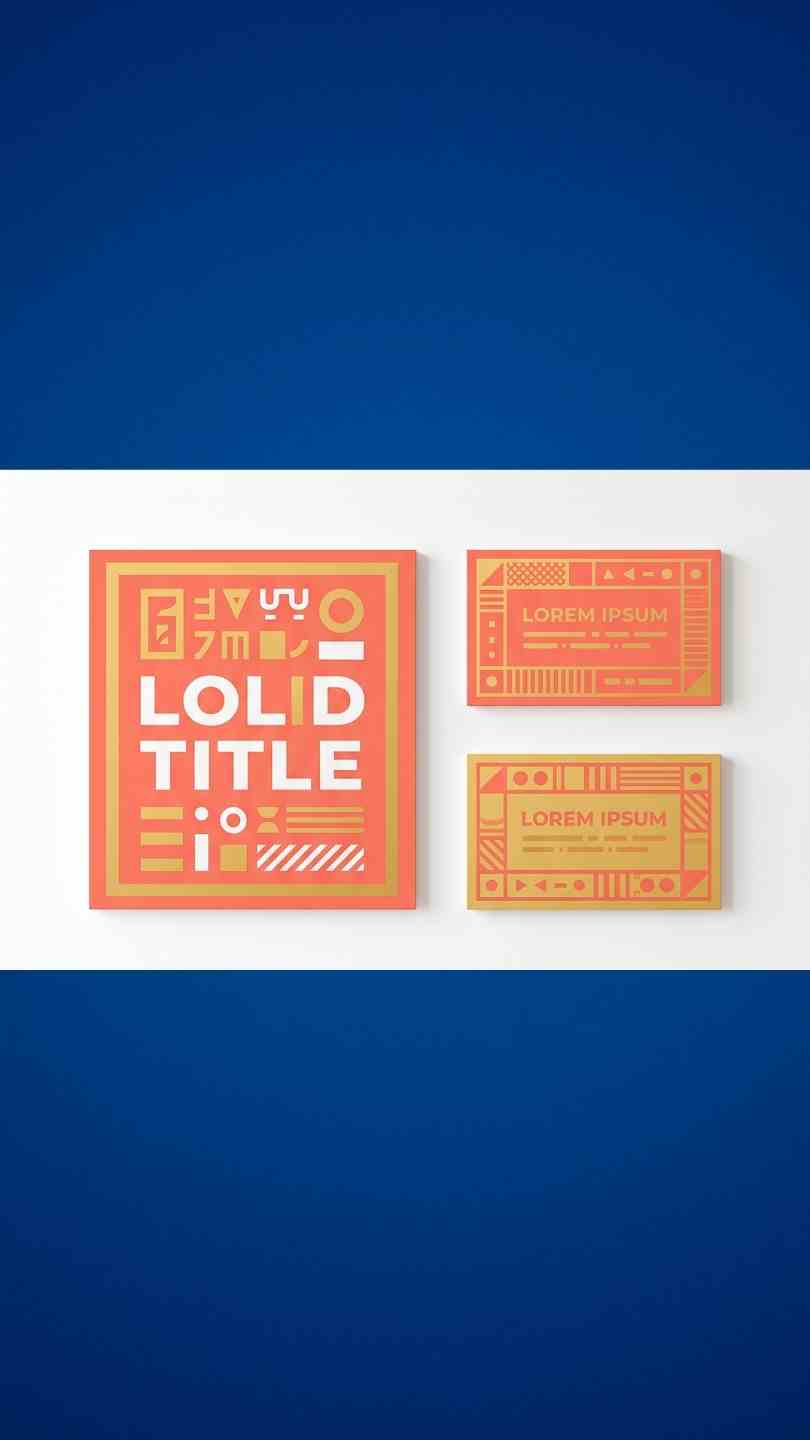
Minimal Clean Lower Third 02, a focused 3 zone Premiere Pro MOGRT matching the 01 template family for consistent branding.
Download FREEGo Pro To DownloadDownload NOW!Minimal Clean Lower Third 02 takes its more elaborate sibling's four zone structure and deliberately removes one, the Lower Text zone, leaving a genuinely more focused three zone design, Main Text, Logo Text, and Top Text, while keeping the exact same confirmed font pairing and construction underneath.
If you're building this into a broader branded corporate project, our Premiere Pro Shortcuts guide is genuinely useful here, since efficiently navigating multiple independently controllable zones within the Essential Graphics panel benefits considerably from knowing the right keyboard shortcuts. For music with the kind of clean, professional energy that pairs naturally with a considered lower third, Artlist carries a genuinely strong selection well suited to this exact tone.
Comparing this template directly against Minimal Clean Lower Third 01 confirms a deliberate simplification rather than a technical limitation, the Lower Text zone, previously set in NexaLight at size 55 in the fuller variant, is genuinely absent here. This makes sense for projects where a single supporting line beneath the main name isn't necessary, cases where your Main Text and Top Text already communicate everything the specific moment needs, without requiring a fourth, more granular layer of detail. Having both the fuller 01 variant and this more focused 02 variant available from the same matching family means you can choose the right level of complexity for each specific moment without sacrificing visual consistency.
In Premiere Pro, go to Window, then Essential Graphics, and use the Browse tab to install the MOGRT file.
Drag Minimal Clean Lower Third 02 directly onto your timeline at the appropriate moment.
Switch to the Edit tab and update the Main Text field, your primary name or headline, in its confirmed NexaBold weight.
Update the Logo Text zone with your brand wordmark, keeping in mind its considerable size relative to the other zones.
Update the Top Text zone with supporting context, styled in the lighter NexaLight weight.
Adjust each of the three zones individually to fit your specific footage and brand palette.
Play back your timeline to confirm all three zones read clearly together, then export using your project's standard settings.
For a genuinely useful walkthrough of working with multi zone MOGRTs directly inside Premiere Pro, watch How To Create Responsive MOGRTs For Premiere Pro. This is worth watching specifically because it covers how independently exposed position, scale, and color controls actually translate into the Essential Graphics panel, directly relevant to managing this template's three genuinely separate zones efficiently.
The dedicated Logo Text zone paired with a more focused three zone structure suits corporate content wanting brand presence without excess complexity.
Removing the Lower Text zone speeds up customization for projects where a single supporting context line isn't necessary.
The more focused three zone structure suits shorter form content where excessive text detail can feel unnecessary.
Projects needing brand presence and basic speaker identification, without the fuller variant's additional supporting line, benefit from this more focused structure.
Projects using the 01 variant for primary speaker introductions can use this simpler 02 variant for secondary or supporting moments.
Since this template was specifically built around a confirmed NexaBold and NexaLight pairing, matching its 01 sibling exactly, substituting different fonts for your own brand typography is worth doing thoughtfully. Maintaining a similar bold and light contrast across your own chosen typefaces preserves the template's intended visual hierarchy, while flattening both zones to a single uniform weight undermines the deliberate structure this template was built around.
The confirmed size 271 assigned to the Logo Text zone, identical to its 01 sibling, is genuinely substantial, roughly double the size of the Main Text zone at 139. At this considerable scale, the Logo Text zone functions less like conventional supporting text and more like an actual wordmark or brand signature. This suggests the template's designer intended this specific zone to carry genuine brand presence within the overall composition regardless of which variant you're using, treating it as a genuine brand element deserving the same care you'd give an actual logo file rather than defaulting to lengthy descriptive text.
Confirmed directly from the embedded project report, this template relies on a single Fill effect internally, identical to its 01 sibling and considerably simpler than the Stroke and Tint combination used in the related Title series. Fill effects are typically used to apply solid color to a layer's shape or alpha channel, suggesting this template's color controls work by directly filling shape or text layers, contributing to its genuinely clean, minimal visual character across all three included zones.
Assuming this variant is simply an incomplete version of the 01 template. Its three zone structure is a deliberate simplification suited to different specific use cases.
Overloading the Logo Text zone with lengthy text at its large default size. This zone was built for a brief wordmark, not extended copy.
Forgetting the template is a MOGRT rather than a native project file. All customization happens through Essential Graphics directly in Premiere Pro.
Confirmed directly from the template's embedded project report, Minimal Clean Lower Third 02 originates from a source project dated February 2020, the same period as its 01 sibling. Both rely on the same single, stable Fill effect and Classic 3D rendering, confirming these two variants share an identical technical foundation and differ purely in their zone structure.
Minimal Clean Lower Third 02 gives Premiere Pro editors a genuinely focused, three zone alternative to its fuller sibling, built on the exact same confirmed NexaBold and NexaLight font pairing and Fill based construction. Understanding when this more focused structure genuinely serves a project better than the fuller four zone variant, and respecting the template's built in font weight hierarchy when customizing, gets you the most value from this template across corporate branding, quick turnaround interviews, and any project needing clean brand presence without excess complexity.
NexaBold for the Main Text and Logo Text zones, and NexaLight for the Top Text zone, confirmed directly from the template's embedded project data.
No, it's a Premiere Pro Motion Graphics Template, fully editable within the Essential Graphics panel.
This variant omits the Lower Text zone present in the 01 template, offering three zones instead of four for a more focused use case.
Not directly within Essential Graphics, if you specifically need the Lower Text zone, the 01 variant already includes it natively.
A single Fill effect, confirmed directly from the template's embedded project report, matching its 01 sibling.
Affiliate Disclosure: This post may contain affiliate links. If you make a purchase through one of these links, FreeVisuals may earn a commission at no extra cost to you. We only recommend products and platforms we genuinely believe in. Read our full disclosure policy.
Download free video templates, LUTs, and presets for Premiere Pro, After Effects, DaVinci Resolve, CapCut, and Final Cut Pro.