.avif)
Freevisuals

Typography Text Titles Part 01 by MotionTores, vibrant contemporary After Effects text titles with editable duration, color, and text. Download on Artlist.
Download FREEGo Pro To DownloadDownload NOW!Download On Artlist
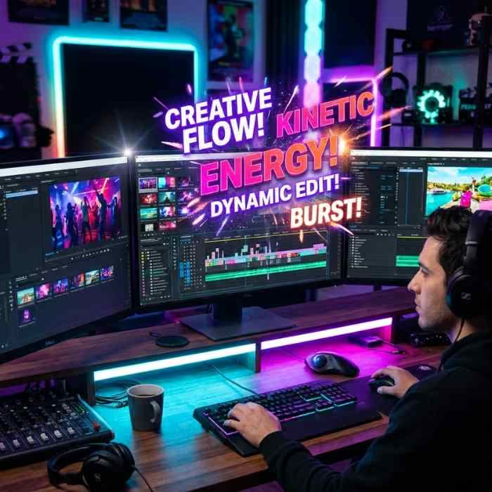
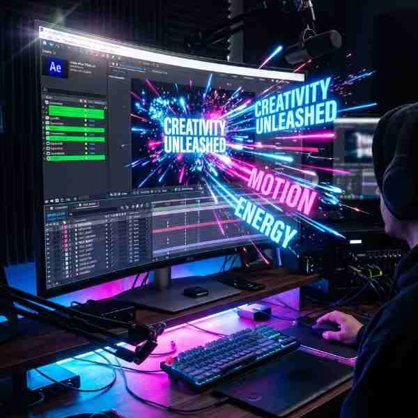
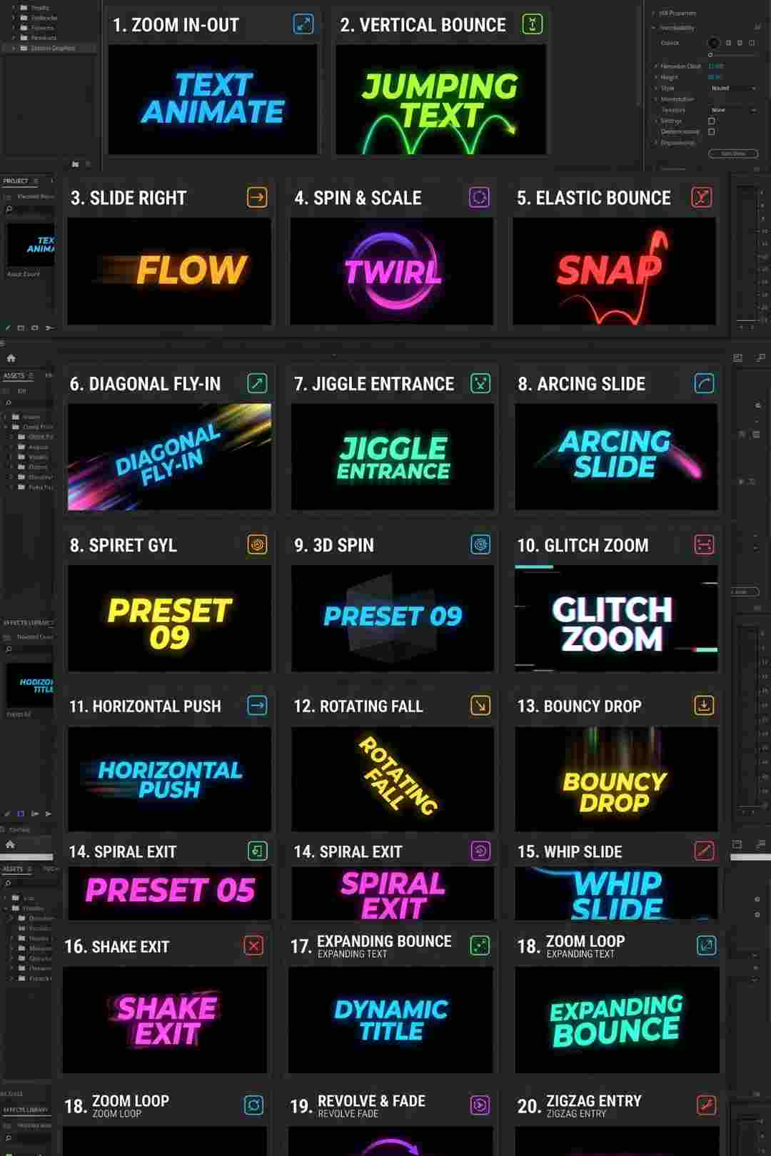
Vibrant, contemporary typography sits in a genuinely useful spot for editors who want text with real energy without going fully into stylized kinetic type territory. Typography Text Titles Part 01, made by MotionTores and available through Artlist, delivers exactly this, creative, dynamically animated text titles built around bold accents and confident color choices, with a fluid, contemporary motion style that reads as genuinely current rather than generic.
If you're building this into a broader colorful, energetic project, our Scale Proportionally tutorial is genuinely useful here, since maintaining clean, undistorted scaling matters considerably once you start resizing bold typographic elements within your own composition. For music with the kind of vibrant, contemporary energy that pairs naturally with this template's aesthetic, Artlist's own music catalogue carries a genuinely strong selection well suited to this exact style.
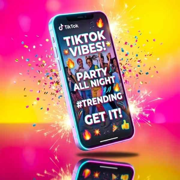
Not every project calls for the restraint of minimal flat design or the rhythm of fully kinetic type, and a considerable amount of genuinely current content, particularly social media, entertainment, and lifestyle content, benefits from typography with real color confidence and fluid, dynamic motion instead. This template's specific combination of bold accent colors and smooth, contemporary animation gives editors a way to add genuine visual energy to a project without needing to build that same energy manually through custom keyframing or elaborate expression driven animation.
The fact that this same pack exists across multiple different editing platforms is also worth noting specifically, since it suggests a genuinely considered, professionally produced asset built to a consistent design standard rather than a single platform specific afterthought, giving you confidence in its underlying design quality regardless of which specific software you personally work in.
Head to the Artlist download page and grab the project files for your specific editing software.
Open the project file in your compatible version of After Effects and allow it to fully load.
Browse through the project's compositions to see the range of included title animations and their specific visual character before deciding which to use.
Double click into each text layer and replace the existing copy with your own.
Update the template's bold accent colors to fit your specific project's palette while preserving the overall vibrant, contemporary character.
Modify each title's specific on screen duration to fit your project's actual pacing requirements.
Use RAM Preview to confirm your finished titles read clearly and at an appropriate pace before committing to a final render.
Bring your finished titles into your main project timeline and render using your standard export settings.
For a genuinely useful walkthrough of building vibrant, contemporary text animation with real color confidence, watch Super Quick Kinetic Typography In After Effects, which covers foundational text animation principles directly relevant to understanding how this template's fluid, dynamic motion has been constructed. This is worth watching specifically because understanding the underlying keyframe and easing logic behind confident, contemporary text motion gives you genuine ability to extend or adjust this template's existing animations beyond simple color and text substitution alone.
The vibrant, energetic aesthetic suits fast paced social and entertainment content wanting genuine visual excitement.
Bold color choices and fluid motion pair naturally with lifestyle and fashion content wanting a contemporary, current feeling visual treatment.
The energetic quality suits event promotion and announcement content wanting to generate genuine excitement and anticipation.
Vibrant typography pairs naturally with music focused content across a range of genres wanting genuine visual energy behind their artist branding.
Creators wanting a distinctive, colorful opening moment can use this template to establish a recognizable, energetic brand identity.
For editors or teams working across mixed software environments, a designer using DaVinci Resolve while a separate editor works in Premiere Pro, for instance, having the same underlying title design available consistently across multiple platforms genuinely matters. It means a consistent visual identity can be maintained across a project regardless of which specific application different team members happen to be using, rather than requiring separate, potentially visually inconsistent title assets purchased individually for each different software environment a team happens to work across.
This cross platform consistency also provides genuine future flexibility, since an editor who eventually transitions between different primary editing software, or who occasionally needs to complete work in a colleague's different application, retains access to the exact same visual title language without needing to source an entirely new, potentially different looking replacement asset.
Since this template's bold, distinctive typography relies partly on its specific chosen typeface, it's worth confirming the font itself carries appropriate licensing for your intended use, particularly for commercial or client work, separate from the template's own licensing terms. Many templates use specific free or premium fonts credited within their documentation, and confirming this specific font's licensing covers your actual intended use case, especially for larger commercial campaigns, avoids a licensing gap that purely checking the video template's own license would not necessarily catch on its own.
This is a small additional step worth building into your regular workflow specifically for templates featuring distinctive, memorable typography, since the font itself often carries just as much of a project's actual visual identity as the surrounding animation and color treatment does.
For editors needing to adapt this template's vibrant typography across different delivery formats, standard widescreen alongside a vertical version for Stories or Reels, for instance, it's worth planning your specific text length and positioning with both formats in mind from the outset rather than building exclusively for one aspect ratio and attempting to retrofit the other afterward. Shorter, more concise text generally translates more cleanly across different aspect ratios than longer phrases that may have been comfortably sized for a wide format but become cramped or require significant resizing within a narrower vertical composition.
Building this kind of cross format flexibility into your initial planning, rather than treating each aspect ratio as an entirely separate build from scratch, considerably speeds up delivering the same core content across the range of formats a typical modern content distribution strategy actually requires.
Muting the template's default vibrant colors down to overly subtle tones. This undermines the specific visual energy that makes this template genuinely distinctive in the first place.
Using overly long text that doesn't suit the template's fluid, punchy motion style. Keep replacement text concise and impactful rather than lengthy and detailed.
Ignoring the specific platform version compatibility when downloading. Since this pack spans multiple editing applications, confirm you've downloaded the correct specific version matched to your own actual software before attempting to open it.
Pairing this vibrant, energetic style with a tonally mismatched, overly serious project. This template's genuine strength lies in energetic, contemporary content specifically, rather than formal or somber projects.
When using several individual titles from this pack together within a single project, it's worth applying the same kind of deliberate pacing consideration you would use for any multi title sequence, varying energy levels slightly between consecutive titles rather than running every single one at an identical intensity throughout your entire finished project. This kind of subtle variation keeps a viewer's attention genuinely engaged across a longer sequence, rather than letting the pack's inherently bold, energetic character start to feel monotonous once repeated identically several times in a row without any deliberate rhythmic variation applied.
As with any Artlist asset, reviewing the current license terms before using this template within paid client or commercial work is worth doing upfront, particularly for entertainment, music, and lifestyle brand work where licensing clarity matters considerably. Confirming your specific intended use case is properly covered protects both your own business and gives your client genuine confidence in the assets underlying their finished deliverable.
This is a worthwhile step regardless of how frequently this template becomes part of your regular workflow, since licensing clarity remains important whether this asset is used once or becomes a recurring part of your standard toolkit across future projects and client engagements.
Since this template covers a specifically energetic, contemporary aesthetic well, it's worth thinking of it as one entry within a broader personal title library rather than your only text animation resource. Pairing it with a more understated option for calmer content and a bolder, more experimental option for genuinely high impact moments gives you real range across the different tonal needs a typical content calendar actually presents, rather than defaulting to a single vibrant treatment regardless of whether it genuinely fits every specific project.
Typography Text Titles Part 01 delivers exactly the kind of confident, energetic typography many contemporary projects genuinely need, bold accent colors, fluid dynamic motion, and editable duration, color, and text all combined into a genuinely current, distinctive visual language. Its confirmed cross platform availability across After Effects, Premiere Pro, DaVinci Resolve, and Final Cut Pro X adds real practical value for editors and teams working across mixed software environments, giving you consistent visual results regardless of which specific application a particular project happens to require.
Taking the time to pair this template thoughtfully with genuinely bold color choices, appropriately concise text, and a matched, complementary font, while planning ahead for any cross format delivery needs your specific project may have, gets you the most genuine value from this template across a wide range of future vibrant, contemporary content you produce.
Yes, this same title pack is confirmed available across After Effects, Premiere Pro, DaVinci Resolve, and Final Cut Pro X.
No, it works entirely with native tools across each supported platform.
Yes, duration is directly editable to fit your specific project's pacing needs.
Social media, entertainment, lifestyle, fashion, and music focused content genuinely benefit most from its vibrant, contemporary energy.
Generally yes, though checking that your chosen typeface's specific character spacing still reads well within the existing bold, fluid animation timing is worth testing directly.
Affiliate Disclosure: This post may contain affiliate links. If you make a purchase through one of these links, FreeVisuals may earn a commission at no extra cost to you. We only recommend products and platforms we genuinely believe in. Read our full disclosure policy.
Download free video templates, LUTs, and presets for Premiere Pro, After Effects, DaVinci Resolve, CapCut, and Final Cut Pro.

%20Profile%20Pic.jpg)