.avif)
Freevisuals
I've been coloring footage professionally for years now, across agency work, client projects, and everything I put out here on FreeVisuals, and if there's one thing I've learned, it's that you genuinely don't need an expensive LUT subscription to get a grade that looks intentional. I keep a small rotating shortlist of free packs I actually reach for on real projects, not just ones sitting unused in a folder somewhere, and these five are the ones that have earned a permanent spot in my workflow. Here's what I actually use, when I reach for each one, and how I apply them so they don't look like a filter slapped on top of raw footage.
The best free LUT packs for most editors are a dedicated Teal and Orange grade for cinematic work, and the 22-file Mega LUT Pack for genuine range across varied projects, both free through FreeVisual. This is a first hand rundown of the five free LUT packs I personally use most often in my own color grading work, a dedicated Teal and Orange grade, a warm Coffee Shop and Cafe Vibes look, a 10 file Cinematic pack, a 22 file Mega LUT Pack, and a 35 file DaVinci Resolve focused collection, all available free through FreeVisuals. I'll walk through when I actually reach for each one, how I apply LUTs in my own Premiere Pro and DaVinci Resolve workflow, and the specific habits that keep my grades looking intentional rather than over processed. It includes two video walkthroughs and answers to the questions I get asked most often about color grading with LUTs.
I get asked this a lot, why would someone who colors footage professionally still use free LUTs instead of building every grade from scratch or paying for a premium pack. Honestly, a good free LUT does exactly what I need it to do most of the time, it gets me somewhere close to my intended look in seconds, and then I spend my actual time refining from there rather than starting from a flat, uncorrected clip. On a genuinely tight deadline, that head start matters. These five specifically have survived years of me testing new packs against them and going right back to my originals, which is honestly the best endorsement I can give any tool.
This is genuinely the first LUT I reach for when a client says they want something that "feels cinematic" without being able to describe exactly what that means. Available through FreeVisuals, it pushes warm orange into the highlights while cooling shadows toward a deep teal, and I've used it on travel edits, fashion content, and commercial work more times than I can count. What I like about it specifically is the matte finish, it doesn't push contrast so hard that skin tones start clipping, which is the actual failure point I see most often when editors chase this exact look manually.
.jpg)
My honest workflow with this one, I apply it, immediately drop intensity to around 65 percent, then nudge shadows and midtones slightly depending on the footage. It rarely needs more than that.
What genuinely sells me on this specific LUT over the dozens of other teal and orange options out there is how well it holds up on footage that isn't perfectly lit to begin with. A lot of teal orange presets I've tested look fantastic on golden hour footage and fall apart the moment you throw flat, overcast daylight at them, the teal shifts turn muddy and the orange starts looking artificial rather than warm. This one genuinely handles both conditions reasonably well, which matters a lot when you're grading a full day's worth of footage shot across changing light rather than a single perfectly timed sunset shot.
The genuine downside, and I'll be upfront about this, is that it's a strong look. It's not subtle, and it's not meant to be. If a client wants something understated or naturalistic, this isn't the LUT I reach for, I'll go somewhere else entirely or build something custom. I've also noticed a specific quirk with skin tones on people with genuinely warm undertones already, past about 85 percent intensity it can push things slightly orange in a way that reads as unnatural rather than warm, so I watch that threshold specifically on any footage with faces in close frame. It's also not the one I'd choose for anything corporate or genuinely formal, the mood it creates is unmistakably cinematic and dramatic, which is exactly wrong for a board presentation or a plain product demo.
Where it consistently wins for me is travel and fashion work specifically, the kind of content where the whole point is making the viewer feel something a bit larger than life. I've had more than one client specifically request "that orange and blue movie look" after seeing something graded with this exact LUT, without ever knowing the technical name for what they were responding to, which tells you something about how effective it actually is at hitting a recognizable, desired feeling.
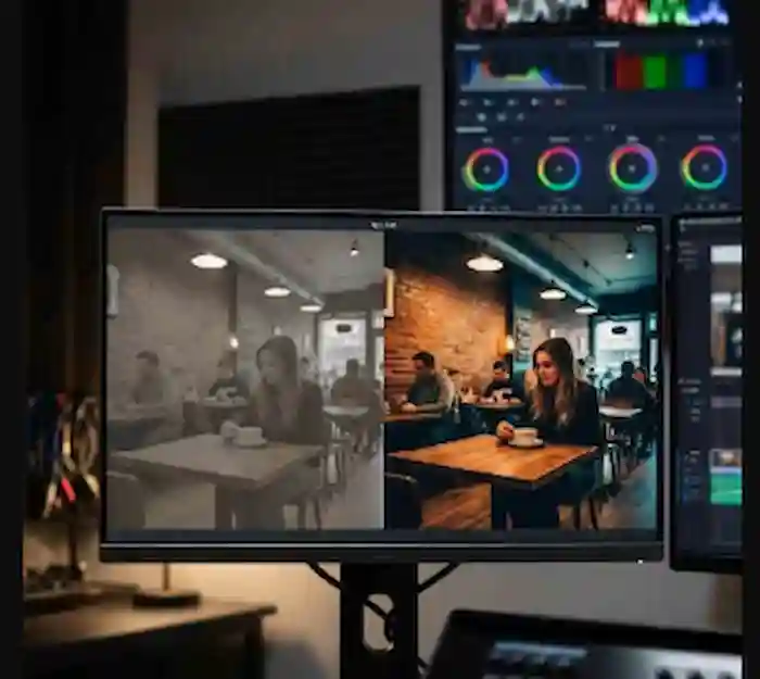
I built up a real soft spot for this one working on lifestyle and food content specifically. Also from FreeVisuals, it's a warm, low key, brown toned grade that genuinely flatters wood interiors, warm practical lighting, and skin tones all at once, exactly the combination you get filming inside an actual cafe. I don't reach for this one on anything high contrast or corporate, it's not built for that, but for a genuinely cozy, intimate piece, I haven't found a free alternative I like better.
A tip from actually using this one regularly, watch skin tones closely if you push the intensity too high, the warmth can start looking slightly muddy on some skin tones. I usually cap it around 70 percent and correct separately if needed.
.jpg)
What I genuinely appreciate about this one, beyond the obvious warmth, is how naturally it handles mixed lighting, the kind of scene you actually get in a real cafe where you've got warm tungsten interior lighting fighting against cooler daylight coming through a window. A lot of warm toned LUTs I've tried just push everything uniformly warm regardless of the source light, which ends up looking flat and slightly wrong once you know what to look for. This one seems to respect the existing color temperature difference between the window light and the interior light rather than steamrolling it, which produces a considerably more believable, dimensional result.
The specific quirk I've learned to work around, it can genuinely struggle with green tones, plants specifically, which show up constantly in cafe and lifestyle content. Past a certain intensity the greens can shift toward a slightly sickly yellow brown rather than staying naturally green, so on any shot with visible foliage I'll either cap intensity lower than I normally would or apply a small secondary correction just to the green channel afterward. It's a genuine limitation, not a dealbreaker, but it's the kind of thing you only learn by actually using a LUT across enough varied footage rather than judging it off a single preview clip.
On the disadvantage side more broadly, this is a genuinely niche LUT. I wouldn't recommend it to someone looking for one dependable all purpose grade, it's built for a specific mood and doesn't flex much beyond that. But within its actual lane, warm lifestyle, food, cafe, small business content, I genuinely think it punches above its weight compared to plenty of paid packs claiming to do the same thing. I've had clients comment specifically on how "cozy" their footage feels after this grade, without me ever using that word to describe it first, which tells me it's landing the intended emotional target reliably.
This 10 file pack from FreeVisuals is genuinely where I start when I get footage from a new camera or a client I haven't worked with before. Having ten genuinely distinct looks, spanning teal orange, moody desaturation, and vintage warmth, in one .cube pack means I can cycle through all ten against a representative clip in a few minutes and immediately see which direction the footage actually wants to go, rather than guessing blind.
.jpg)
I treat this pack less as a finished look and more as a diagnostic tool. Once I know roughly which direction works, I usually move to a more specific pack, often one of the other four on this list, to actually finish the grade.
The genuine advantage of this pack over a single dedicated LUT is exactly that range packed into one download, ten meaningfully different starting points rather than ten minor variations on the same idea. I've genuinely used this to settle arguments with clients who couldn't articulate what they wanted beyond "make it look better," showing them three or four options from this pack side by side gets a decision made in minutes rather than an hour of back and forth description. That's honestly one of the most practically useful things a free pack has done for my actual client relationships, not just my footage.
The disadvantage, and it's a real one, is that because this pack covers so much ground, none of the ten individual looks are quite as refined or specific as a dedicated single LUT built around exactly one aesthetic. The teal orange option in this pack is genuinely decent, but I still prefer my dedicated Teal and Orange LUT covered above once I know that's the direction I'm heading. Think of this pack as a compass rather than a destination, it points you the right way efficiently, but I rarely ship a final grade using one of these ten looks completely unmodified.
A quirk worth knowing, a couple of the more desaturated, moody options in this pack lose a surprising amount of shadow detail if your source footage was already underexposed to begin with. On properly exposed footage this isn't an issue at all, but if you're working with genuinely compromised source material, maybe a client sent you footage shot in poor conditions, I'd correct exposure more aggressively than usual before testing this pack's moodier looks specifically, or you'll lose information you actually want to keep.
For a genuinely useful look at applying LUTs in practice, watch How To Use LUTs Correctly In DaVinci Resolve 20, Cinematic Color Grading Tutorial. It's a good demonstration of why LUTs so often don't look the way editors expect once applied, and how to actually fix that, which is honestly the part written guides struggle to convey properly, seeing the correction happen live tells you more in thirty seconds than a paragraph of description ever will.
When I'm working across a genuinely varied client roster, and I usually am, the Mega LUT Pack from FreeVisuals earns its place specifically because of its breadth. Twenty two distinct grades, 80s Style, Teal and Orange, Sunrise, Sunset, Nightclub, Supernatural, Marine, Mystic among others, means I genuinely don't need to go searching for a separate niche pack every time a new project lands with a completely different mood than the last one. I've used the Nightclub look on event coverage, Marine on a coastal brand shoot, and Sunset on more wedding adjacent work than I expected.
.jpg)
This is the pack I tell other editors to grab first if they only download one thing from this list, since it genuinely covers the widest spread of use cases from a single source.
The advantage here isn't really about any single look being the absolute best version of that style available anywhere, plenty of dedicated single purpose LUTs will beat individual entries in this pack on their specific home turf. The advantage is genuinely about coverage, twenty two meaningfully different options means I can say yes to almost any project brief without needing to source a new pack first, and that speed matters more to my actual bottom line than marginal quality gains on any one specific look.
Quality does vary noticeably across the twenty two, which is the honest disadvantage worth naming. A handful of the more unusual, stylized options, Supernatural and Mystic specifically, lean hard into a very particular aesthetic that only suits a narrow slice of content, and I've genuinely never shipped client work using either of those two despite having tested them. The bread and butter looks, Teal and Orange, Sunrise, Sunset, Marine, get the overwhelming majority of my actual use, and I'd guess that's true for most editors working through this pack. Don't go in expecting all twenty two to be equally useful, expect maybe eight or nine genuinely strong, reliable options and the rest as interesting extras worth having but rarely reached for.
One genuine quirk I've noticed, the 80s Style look specifically is considerably more aggressive than most of the others in the pack, high contrast with a real color push, and it does not play well layered with other corrections the way the more subtle looks in this pack do. If I'm using that specific one, I apply it essentially last and do minimal additional grading on top, whereas most of the other twenty one tolerate additional secondary correction just fine.
For anything I'm grading natively in DaVinci Resolve specifically, the 35 LUTs Mega Pack from FreeVisuals is genuinely my default starting library. It's the largest collection on this list, 35 unique .CUBE files, and while it's optimized for Resolve, I've used it plenty in Premiere Pro too without issue. Given how many LUTs are in this single pack, I long ago stopped trying to actively use all 35, I've settled into a personal shortlist of about seven that I genuinely reach for regularly, and the rest sit there for the rare project that calls for something more specific.
.jpg)
The genuine advantage of this pack specifically comes down to depth within DaVinci Resolve's own color pipeline. Being optimized for Resolve means these LUTs tend to interact more predictably with Resolve's native color management than packs built with a more generic, software agnostic approach. I've noticed less of the unexpected color shifting I sometimes get applying other packs inside Resolve specifically, where a LUT that looked correct in a preview behaves slightly differently once it's actually running through Resolve's color science.
The honest disadvantage is sheer overwhelm. Thirty five options is genuinely a lot to work through, and unlike the Mega LUT Pack's more clearly differentiated 22 looks, several of the 35 here feel like closer variations on similar underlying ideas rather than each being a completely distinct aesthetic. I'd estimate a genuine third of this pack, once you've used it for a while, starts to feel redundant against other options already in the collection. That's not necessarily a problem if you're actively experimenting and want that overlap to fine tune a specific direction, but if you're looking for maximum distinct variety per download, the Mega LUT Pack's 22 more clearly differentiated looks arguably gives you more genuine range despite the lower total count.
A specific quirk from using this one extensively, a handful of the LUTs in this pack are genuinely subtle, close to a technical correction rather than an obvious creative look, and if you're cycling through quickly during that initial testing phase I described earlier, it's genuinely easy to skip right past a couple of the more understated options simply because they don't announce themselves as dramatically as the bolder looks sitting alongside them in the same pack. I'd specifically recommend slowing down on your first pass through this particular collection rather than judging each one at a glance, some of my favorites from this pack are ones I almost dismissed too quickly the first time through.
My process is genuinely simple. I open Lumetri Color through Window, then Lumetri Color, select my clip, and under the Creative tab I click Look, then Browse, to load whichever .cube file I'm testing. From there I almost never leave the Intensity slider at 100 percent, I typically start around 65 to 80 percent and adjust from there depending on how the specific footage responds.
In Resolve, I keep my LUT folder properly organized, accessed through the cog icon, then Color Management, then Open LUT Folder, and I drop new packs in there directly before clicking Update Lists to refresh them into the application. On the Color page, I right click my clip or node, select LUT, and choose whichever one I'm testing. I keep creative LUTs, which is everything on this list, under Creative, Look, Browse, separate from the technical Log correcting LUTs I sometimes use first under Basic Correction.
If you're working with Log footage the way I do on most shoots, How To Color Grade Fast Using LUTs And Curves covers the exact correction and curve workflow I lean on before a creative LUT ever gets applied. I still point junior editors to videos like this one rather than re-explaining the correction order from memory every time.
If I had to pick a single habit that's improved my grading more than any specific LUT, it's correcting exposure and white balance before applying any creative look, every single time, no exceptions. I learned this the hard way early in my career, spending an hour trying to fix a grade that looked wrong, only to realize the underlying footage was never properly balanced to begin with. Now I check waveforms and vectorscopes on a genuinely representative clip before I even open a LUT browser. It's a small extra step that's saved me considerably more time than it's cost.
Since most of what I shoot and color involves people, I've developed a habit of reviewing faces at both normal size and zoomed in before finalizing any grade. A look that seems fine at a normal viewing distance can read as oversaturated once you're actually zoomed into a face, and this is particularly true with the warmer packs like Coffee Shop and Cafe Vibes. If skin tones start drifting, I'll either drop the LUT's intensity slightly or apply a targeted secondary correction just to that region rather than abandoning the look entirely.
With five packs in regular rotation, nearly 70 individual LUTs if you count everything, I stopped relying on memory a long time ago. I keep folders organized by mood rather than by which pack a LUT came from originally, Warm Interior, Cool Cinematic, High Energy, Natural Outdoor, because when I'm actually mid edit I'm thinking "I need something warm for this cafe shot," not "which pack was that LUT from again." It sounds like a small thing but it's genuinely sped up my workflow more than any single LUT has.
I've got a pretty consistent process before any LUT, free or paid, earns a spot in my regular rotation. I run it against three specific test clips I keep on hand, one with a face in reasonably close frame, one with a genuine highlight and shadow range, and one with a color I know is tricky, usually something in the green to yellow range since that's where I've seen the most LUTs struggle. If a LUT handles all three reasonably well without me needing to fight it, it earns a real shot on an actual project. If it falls apart on any one of those three, I usually shelve it, even if the marketing screenshots looked great.
This might sound like overkill for a free download, but I've been burned enough times by a LUT that looked stunning in a single promotional still and then fell apart the moment I applied it to genuinely varied footage. The three clip test takes me maybe five minutes and has saved me from committing to the wrong look more times than I can count.
I'll be honest, I download new LUT packs constantly, it's genuinely part of staying current in this line of work. But these five keep winning out over newer options for a genuinely simple reason, I know exactly how they behave. I know that the Teal and Orange LUT starts pushing skin tones a bit warm past about 85 percent intensity. I know the Coffee Shop grade needs a slight vignette pulled back if the footage already has one baked in from the lens. That kind of familiarity is genuinely worth more to me on a deadline than a marginally different look I'd need to relearn from scratch.
I'd genuinely encourage anyone building their own rotation to resist the urge to constantly chase the newest pack you see recommended somewhere. Pick a small number, learn their specific quirks properly, and you'll move faster and produce more consistent work than someone who owns fifty LUTs they've each used exactly once.
I had a genuinely tight turnaround job a while back, a brand wanted four completely different mood pieces from the same raw footage, one energetic for social, one calm for their website hero video, one moody for a specific campaign push, and one warm and inviting for an email piece. Normally that's four separate grading sessions. Because the Mega LUT Pack already had genuinely distinct looks spanning that exact range, Nightclub adjacent for the energetic cut, something closer to Marine for the calm piece, I had usable starting grades for all four within about twenty minutes, then spent my actual remaining time refining rather than building each look from a blank slate.
That's genuinely the value proposition for me with a pack like this, it's not that any single look in there is the single best version of that style available anywhere, it's that having genuine range in one place means I'm not hunting across five different sources under time pressure.
Something I've picked up over the years that I don't see discussed enough, I genuinely apply LUTs slightly differently depending on where the content is actually going to be watched. For social content specifically, Reels, Shorts, TikTok, I tend to push intensity slightly higher than I would for the exact same LUT on long form YouTube or client delivery work. Social platforms compress footage more aggressively, and a subtle grade that reads beautifully on a calibrated monitor can look genuinely washed out by the time it's been through a platform's compression pipeline and viewed on an average phone screen in bright daylight.
For long form or client delivery work where I have more confidence in the actual viewing conditions, I pull back and trust the subtlety more. This is a genuine adjustment I make consciously every single time, not something I do by pure instinct, and it's saved more than one social cut from looking flat once it actually went live.
I want to be straight about this since I think a lot of LUT roundups oversell what a free pack can realistically do. For genuinely high stakes commercial work, a broadcast campaign or a feature length project, I don't rely purely on any of these five, or honestly any pre built LUT at all, as my finished grade. I use them as a genuine starting point, then build a custom node tree in Resolve specific to that project's actual needs. Where these five genuinely shine is everyday content, YouTube videos, social content, smaller client deliverables, the volume of work where building a fully custom grade from scratch for every single piece simply isn't a realistic use of time.
Knowing which category a given project actually falls into, and being honest with yourself about when a LUT is genuinely sufficient versus when a project needs real custom grading attention, is honestly a bigger skill than knowing which specific LUT to reach for.
The one I see constantly, and made myself early on, is applying a creative LUT straight onto Log footage without converting it first. It just produces muddy, disappointing results that have nothing to do with the LUT's actual quality. The second is leaving every LUT at full intensity regardless of the footage, when dropping it back and manually fine tuning almost always looks more natural. I also used to rename my LUT files to something more memorable and regretted it more than once when a renamed file caused issues down the line, I now always keep an untouched backup of the original download.
If you're where I was years ago, downloading every free pack you can find and never actually settling into a workflow, my honest advice is to stop collecting and start testing properly. Pick two or three packs, genuinely learn how they behave across different lighting and skin tones, and resist grabbing a new one every time you see it recommended somewhere. The editors I know who produce the most consistent looking work aren't the ones with the biggest LUT library, they're the ones who deeply understand a small handful and know exactly how to push each one before it starts looking wrong.
Start with the Mega LUT Pack if you want breadth to explore, or the Teal and Orange LUT specifically if you already know roughly the look you're after. Either way, spend real time with whatever you pick before moving on to the next one. That's genuinely the difference between footage that looks intentionally graded and footage that looks like someone tried a lot of filters until one felt close enough.
When a project genuinely needs something beyond what these five packs cover, I turn to Artlist regularly, both for their footage library, which is genuinely shot with grading flexibility in mind, and for music once the visual side is locked. For broader asset needs beyond just LUTs, Envato Elements is worth having in your back pocket, and Motion Array has genuinely strong premium LUT packs I've picked up for specific client jobs that needed something more particular than my free rotation.
Once a grade is locked, I'm usually straight into titles and motion graphics, our own Premiere Pro templates library and After Effects templates library get regular use from me here. For music matched to the actual mood of the grade, warm for Coffee Shop, bold for Teal and Orange, I go to Artlist or Epidemic Sound. And if you want to browse everything free I've got up beyond just these five, the full free LUTs library is where I keep adding new ones.
For a broader roundup covering LUTs across Photoshop, DaVinci Resolve, and Premiere Pro specifically, see 5 Best LUTs For Photoshop And DaVinci Resolve. For cinematic packs built specifically for Photoshop, Premiere Pro, and After Effects, see Cinematic LUT Packs For Photoshop, Premiere Pro & After Effects.
Honestly, the Teal and Orange LUT and the Mega LUT Pack see the most use in my day to day work, they cover the widest range of what clients actually ask for.
Every time, no exceptions. It's the single habit that's saved me the most time over my career.
Somewhere between 65 and 80 percent as a starting point, then I adjust from there based on the specific footage.
The Mega LUT Pack, purely because 22 distinct grades from one source gives you the widest range to start experimenting with.
Check the specific license terms on each item page directly before using any of them in paid client work, terms are worth confirming for your specific situation.
These five packs have genuinely earned their place through years of actual client work, not just because they looked good in a marketplace preview. If you're building your own free LUT rotation, I'd start with the Mega LUT Pack for range, add the Teal and Orange LUT as your dependable cinematic default, and go from there based on what your own work actually calls for. The specific LUTs matter less than the habits around them, correcting first, watching your skin tones, testing properly before trusting a new one on real client work, and treating every LUT as a starting point rather than a finished grade.
.avif)
.avif)
.avif)
.avif)